EAC: Reporting disruptions on the go
Project Overview
The EAC mobile app allows residents and businesses in Cyprus to manage electricity services, pay bills, locate EV charging stations, and report infrastructure incidents such as power outages or damaged street lighting.
This case study focuses on redesigning the incident reporting flow, a feature available even to users who are not logged in. The existing experience created unnecessary friction during moments where speed and clarity were critical, especially for users reporting incidents while driving or moving through unfamiliar areas.
My goal was to redesign the flow into a fast, mobile-first, and context-aware experience that reduces effort, minimises drop-offs, and improves reporting accuracy.
The Problem
The existing reporting flow was designed around form completion rather than real-world user behaviour.
Incident category came before location
Users had to categorise the issue before capturing where it happened. This created a major usability problem for users on the move, especially drivers, because the location could quickly change or be forgotten.
The location step was overloaded
The map was visually small and shared space with
- validation inputs
- comments
This created cognitive overload during a high-context task.
Poor grouping of information
The steps mixed unrelated tasks together:
- contact details with image uploads
- comments with location selection
The flow did not match how users naturally describe incidents.
The result was a flow that felt slow and cumbersome in exactly the moments when speed mattered most. Many reports simply went unfiled because the effort wasn't worth it.
The flow of the reporting an incident in the old application
New Changes
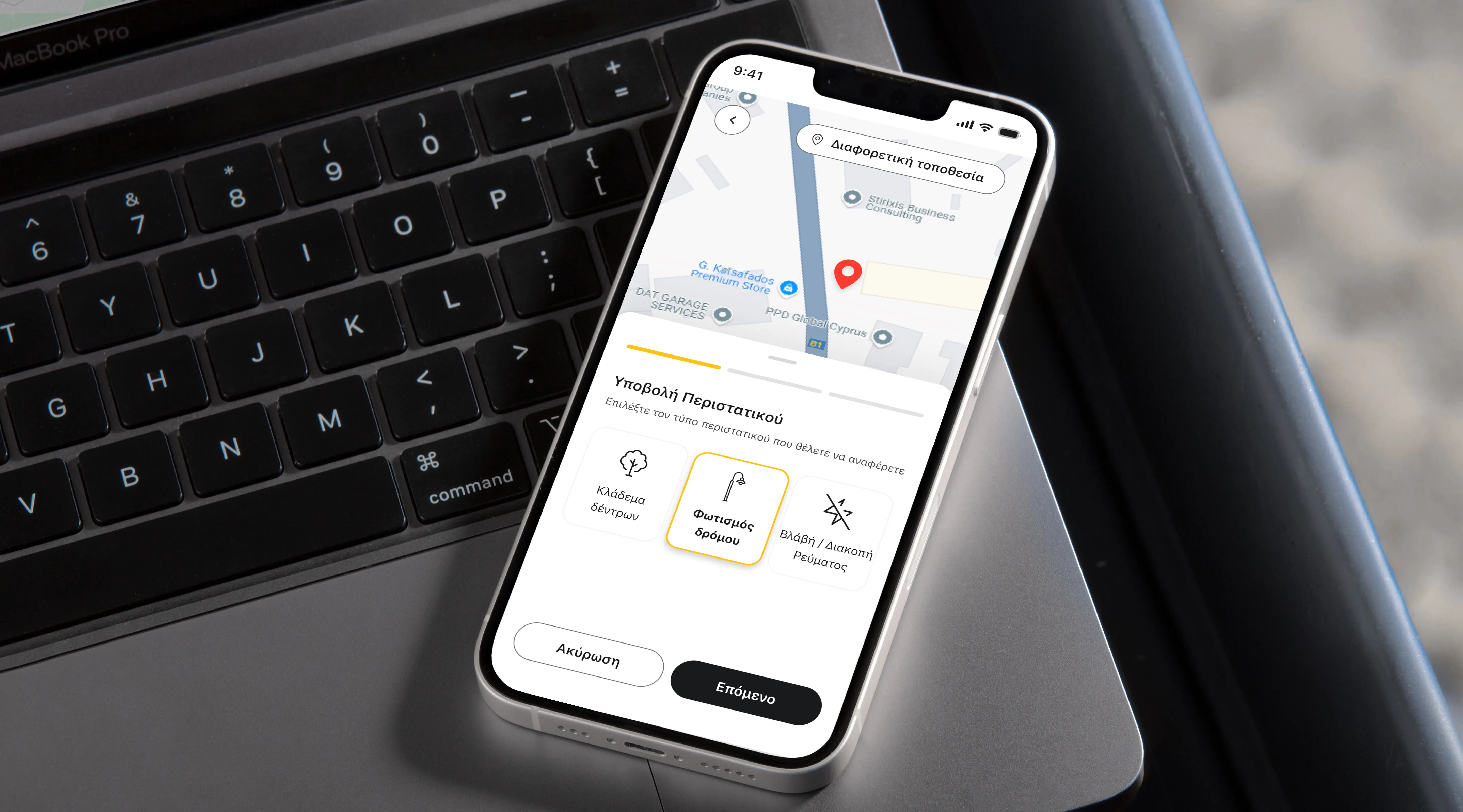
Decision 1: Start with location, not category
Problem
The previous flow asked users to categorise the incident before confirming their location. For users on the move, this created friction since the category stays the same, but the location can quickly change or be forgotten.
The location screen was also overloaded. The map was small and combined with mandatory text fields to validate the address, without considering that users might be in an unfamiliar area and not know the exact location.
Solution
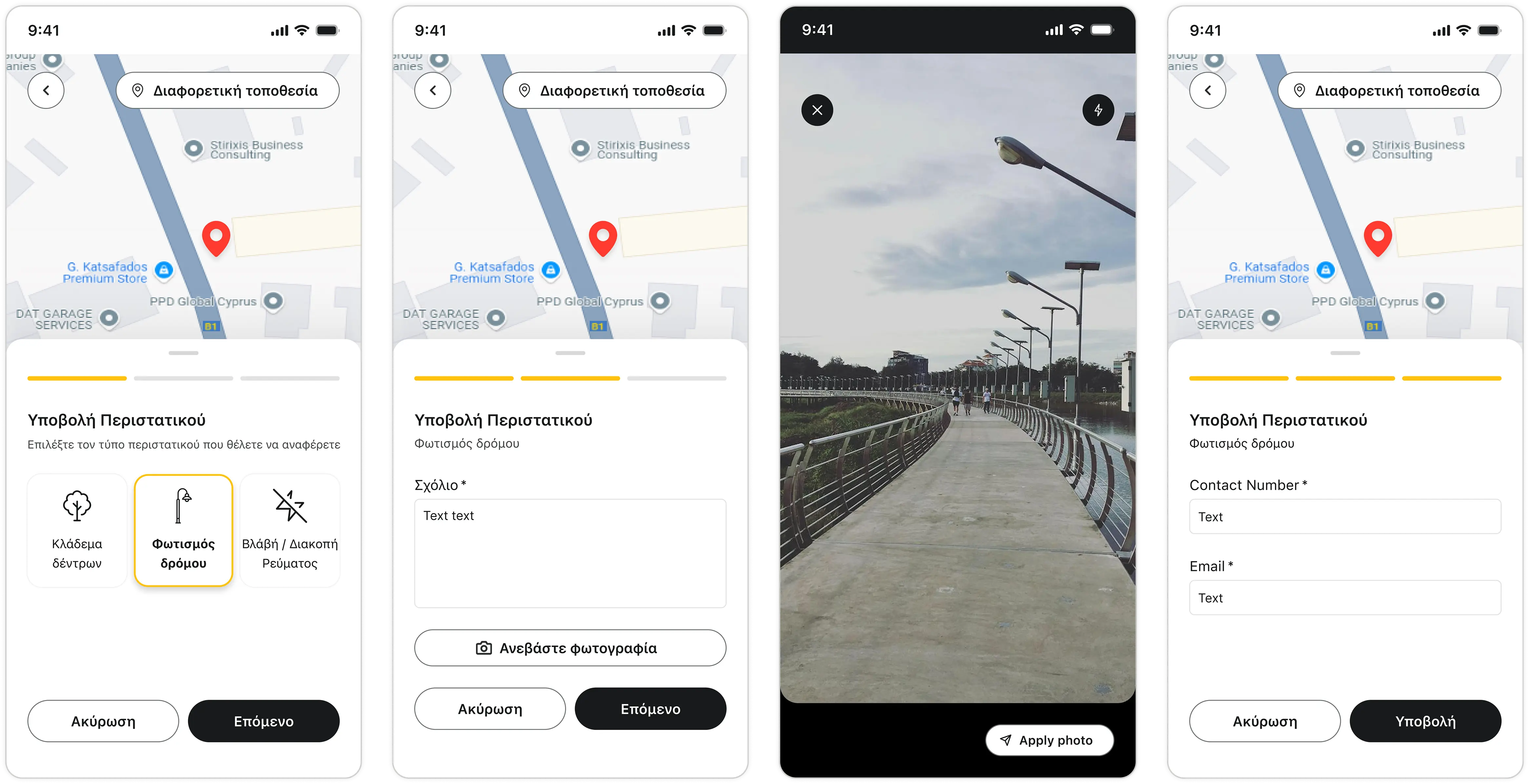
I redesigned the flow to start with location first.
The experience opens directly on a map with the user's current location already pinned, while incident selection begins immediately in a bottom drawer.
Users can expand the map into full screen for more precise pin placement, or choose a different location and use traditional address fields if needed.
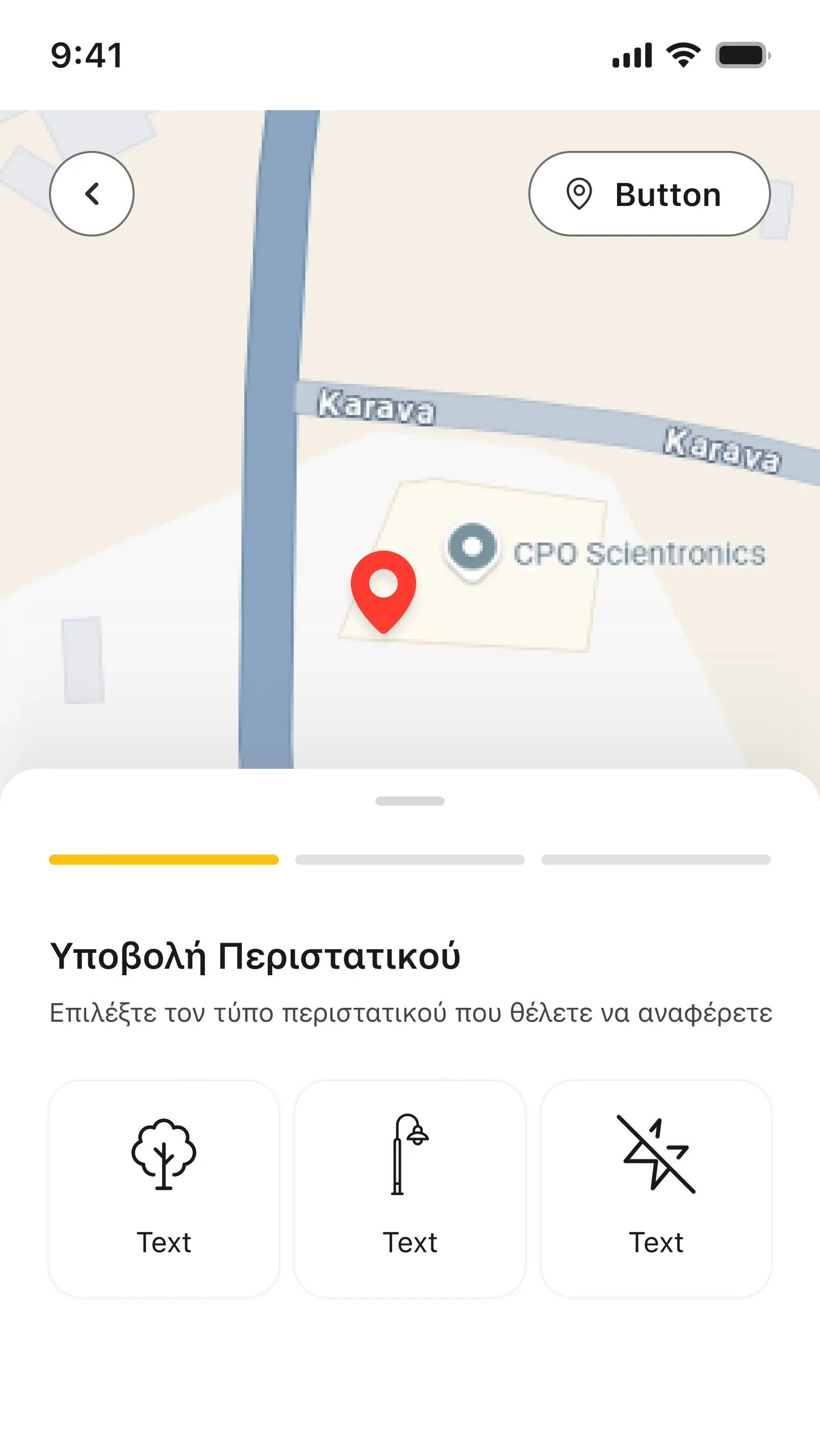
Location is confirmed first, with the incident type selected immediately in a bottom drawer.
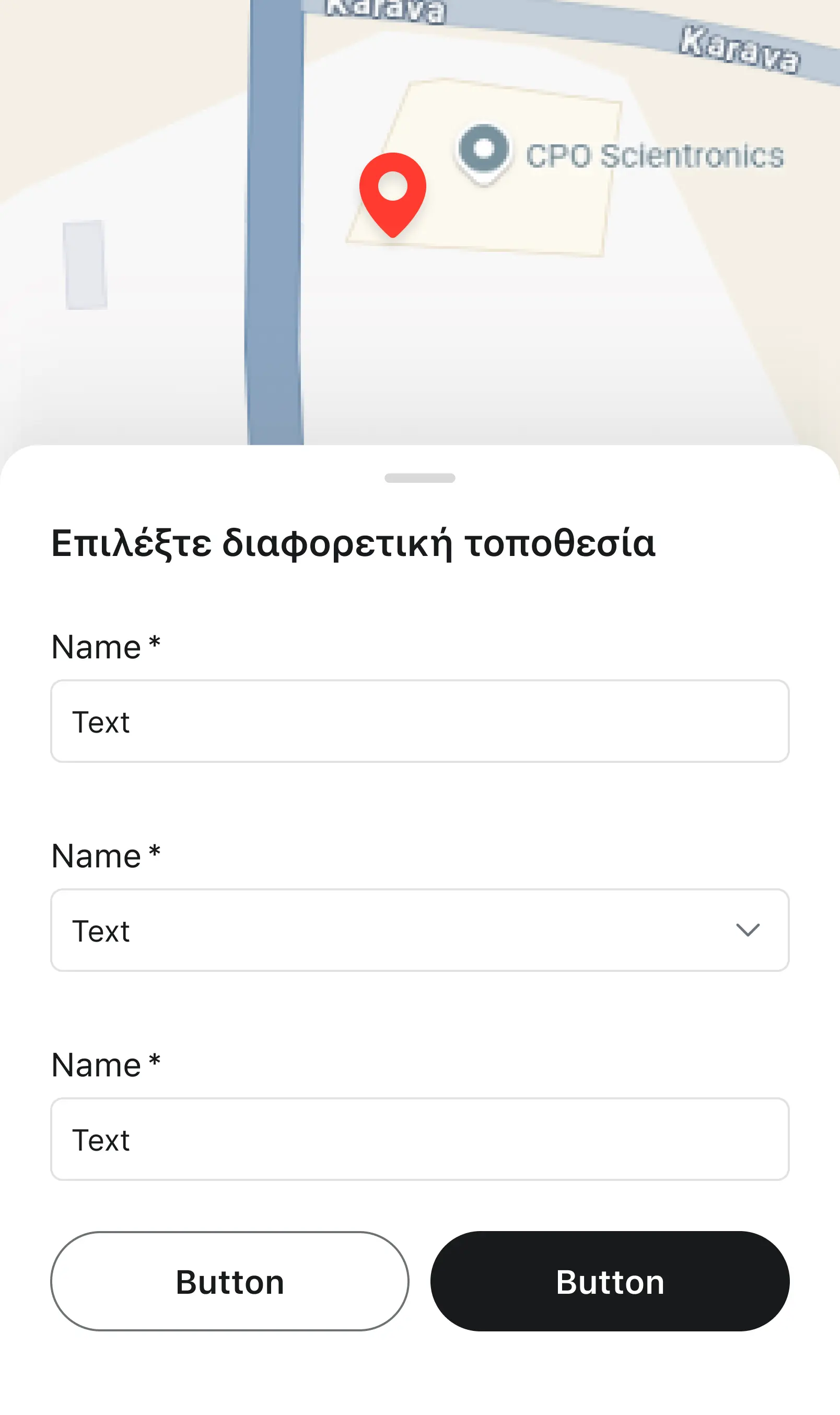
Address fields only appear when the user switches to a different location
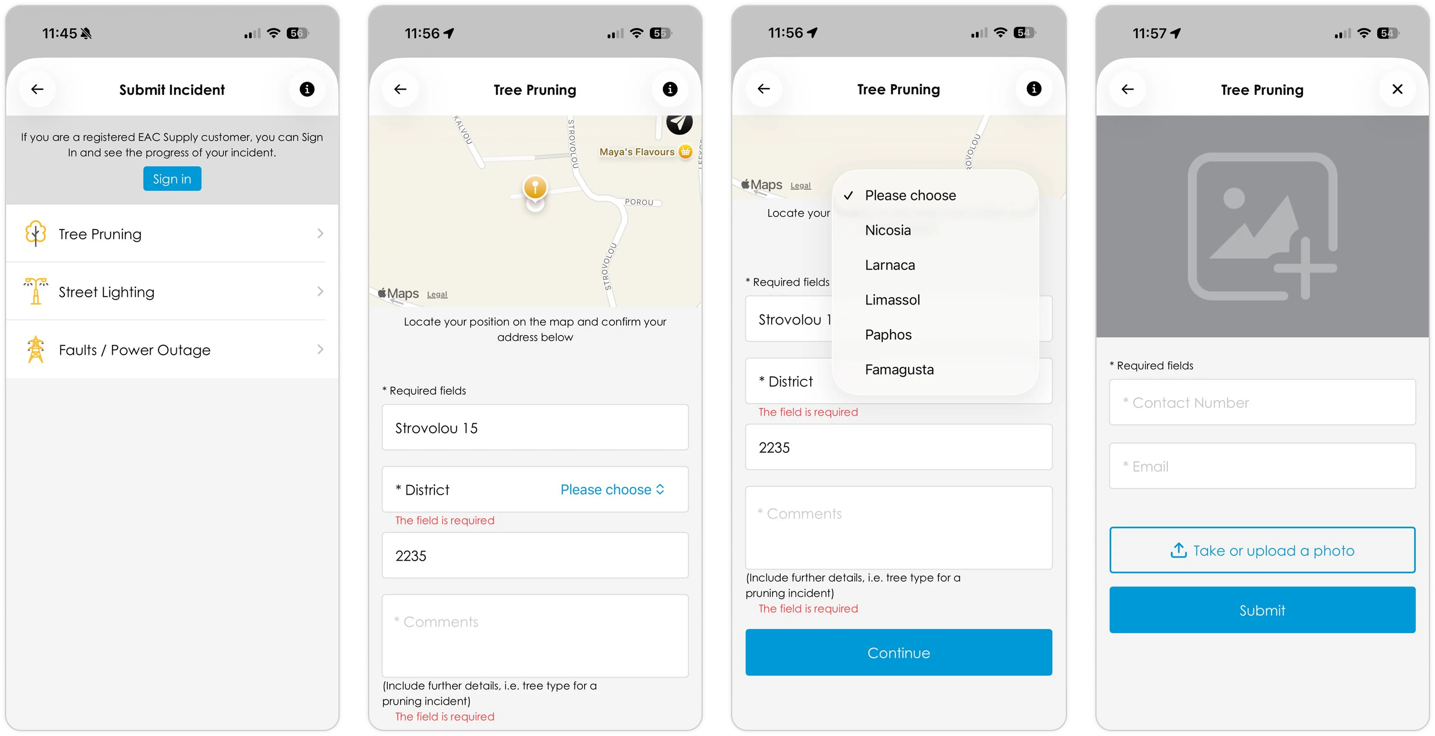
Decision 2: Text fields only when unavoidable
Problem
The old flow used open text fields for most inputs, forcing users to type or read text when it was not really necessary.
Solution
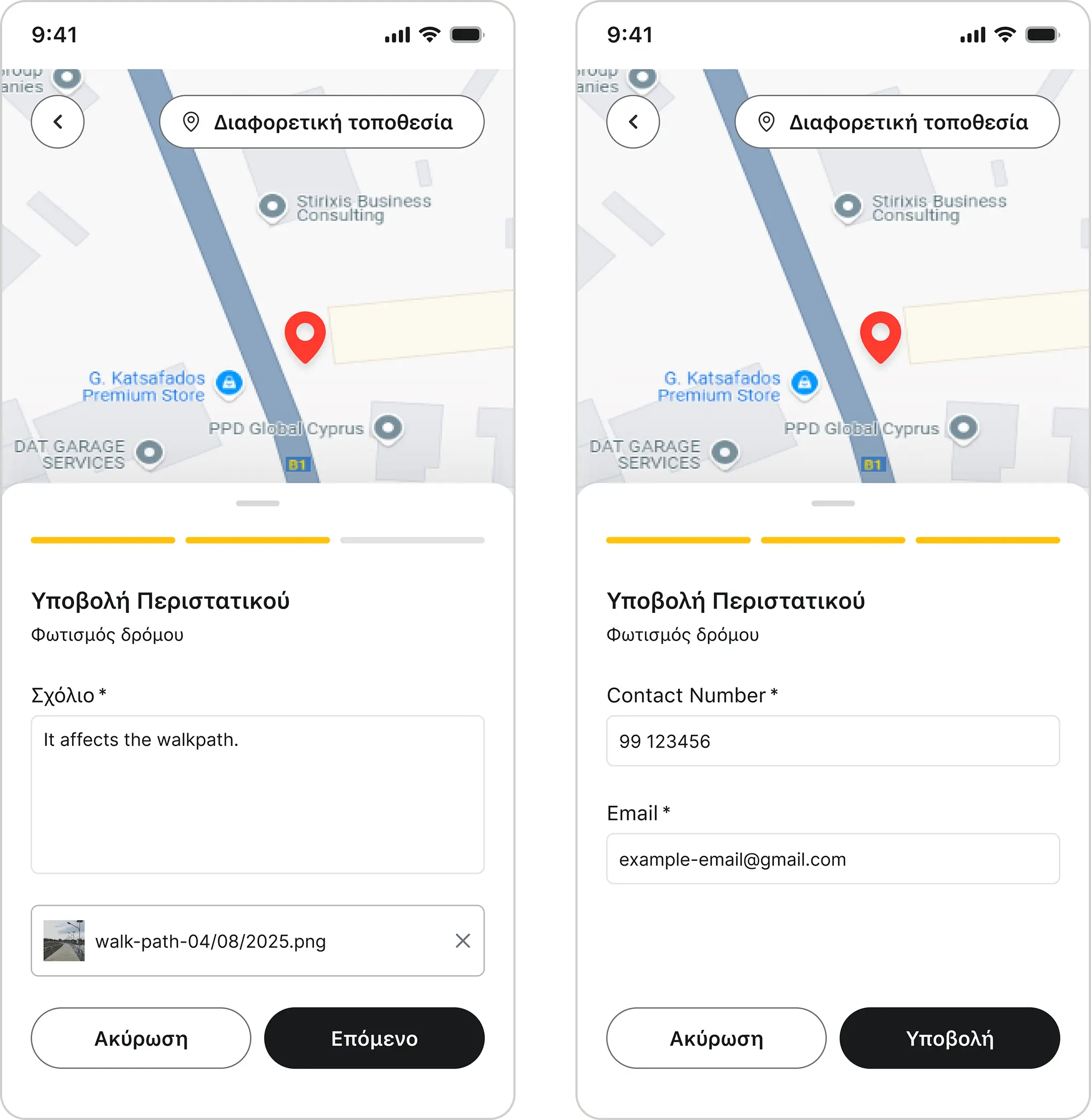
Text fields are used only when needed. The address fields for location are only visible when the user wants to add a different location. A comments field remains as a mandatory way to let users communicate more detail.
The incident category selection was replaced with large icon-led tiles. Each tile is large enough to tap confidently without zooming in or squinting. Labels are short and in plain language. Step 3 is skipped entirely for logged-in users, since the system already holds their contact information.
Decision 3: Reorganise the steps
Problem
Fields and tasks were not grouped by relevance. The location step included comments, while the contact information step included a photo upload. The flow did not match how users naturally describe incidents.
Solution
I changed the flow and reorganised it in the way a user would explain the incident in spoken language:
- Step 1: Define the location and the incident type
- Step 2: Give details of the incident and an image for proof
- Step 3: Share your contact information
"I am here in front of the X restaurant and there is a tree branch…" = Step 1
"…fallen in the middle of the street." = Step 2
"If you have more questions, contact me here." = Step 3
The redesigned three-step flow mirrors how users naturally describe an incident
The flow of the reporting an incident in the old application
Impact
I redesigned the EAC mobile app's incident reporting flow to work for the way people actually report problems: quickly, on the move, and often under stress. By leading with location, replacing form fields with tap-friendly tiles, and restructuring the flow to mirror natural language, the experience shifts from a serious form into a fast, friendly tool. The result is a higher likelihood of completed reports, cleaner data for EAC operations, and a stronger perception of a utility that's easy to deal with.
Presenting EAC as a responsive company
Meeting users in their real moment of need, for example mid-commute or standing in front of a hazard, repositions EAC as responsive and easy to engage with, directly affecting public trust in a utility brand.
Removed the friction that was killing report volume
A flow short enough to complete in seconds means more incidents reported, a richer real-time view of the grid, and faster intervention on genuine safety risks like fallen branches or damaged street lighting.
Lowered the barrier for every user, not just the ideal one
Icon-led tiles and progressive disclosure (text fields only when truly needed) make the flow usable for older residents, non-native readers, and users reporting under stress, all part of EAC's actual customer base.
Simplified without abandoning edge cases
Traditional address fields remain one tap away, showing mature design judgement: one product that scales across customer segments instead of breaking on atypical scenarios.
Delivered beyond the brief
The original ask was a visual refresh. I went further than just adding the new branding. I audited the flow, flagged friction the client hadn't spotted, and proposed a redesign alongside the new branding. It took experience to spot what was missing, and confidence to put those findings in front of the business rather than quietly delivering the brief as written.
Outcome & Reflection
What I learned
When designing for contextual stress, everything that doesn't serve the core task becomes obvious friction. Stepping into the user's frustration gives you a clear prioritisation of the tasks at hand. While simplifying the UI and the flow I had to remind myself that edge cases are also important. so for every simplification I also added another way to complete the task. The simple and fast map did not replace the text forms; the text forms are still reachable for any user that wants to add a different location from their current one.
Next steps
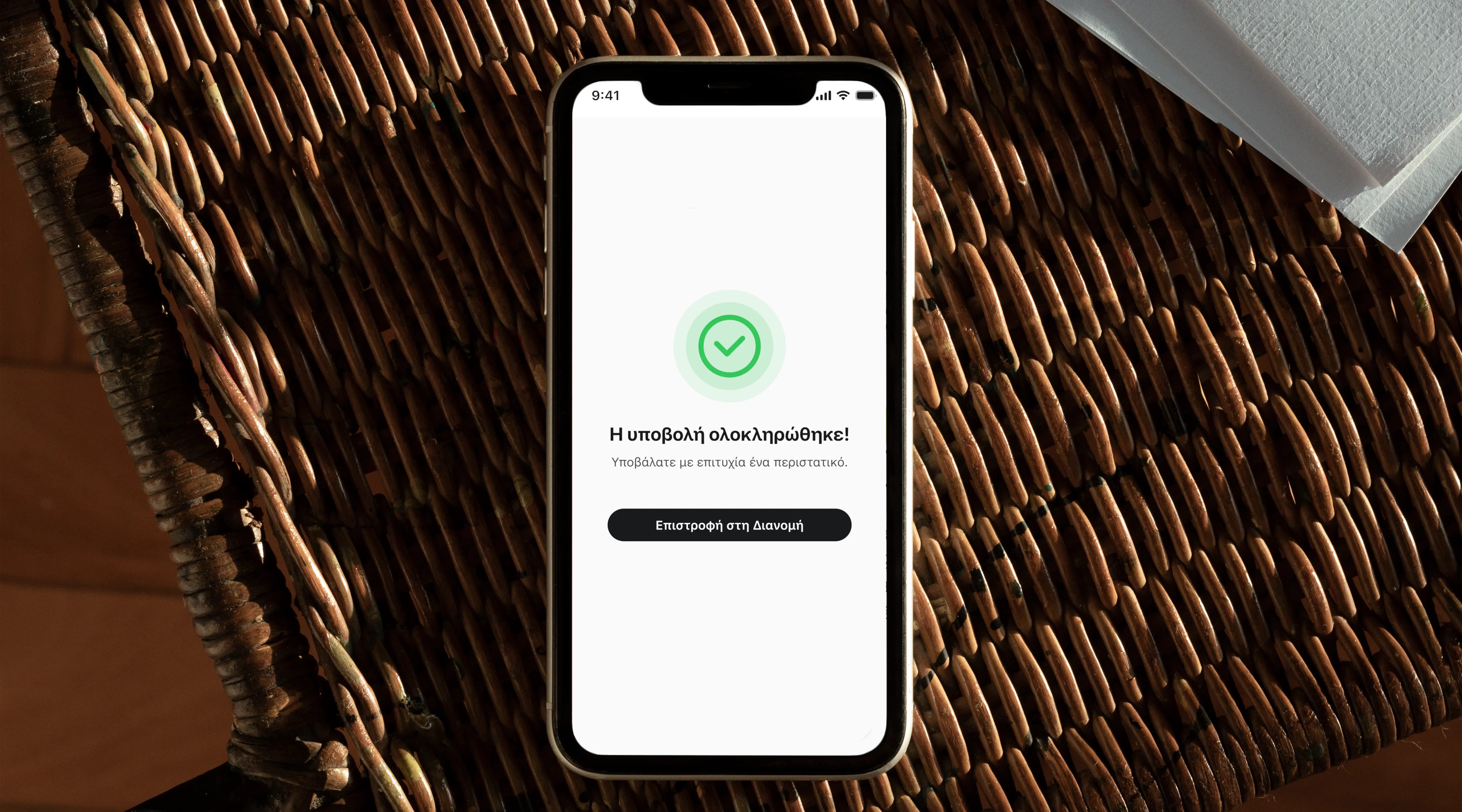
- Submission confirmation with a reference number, giving users evidence their report was received, and reducing repeat submissions for the same incident
- Status updates a notification when the reported incident has been resolved
- Categorisation refinement, user testing to validate whether the tile categories match how users describe incidents in their own words