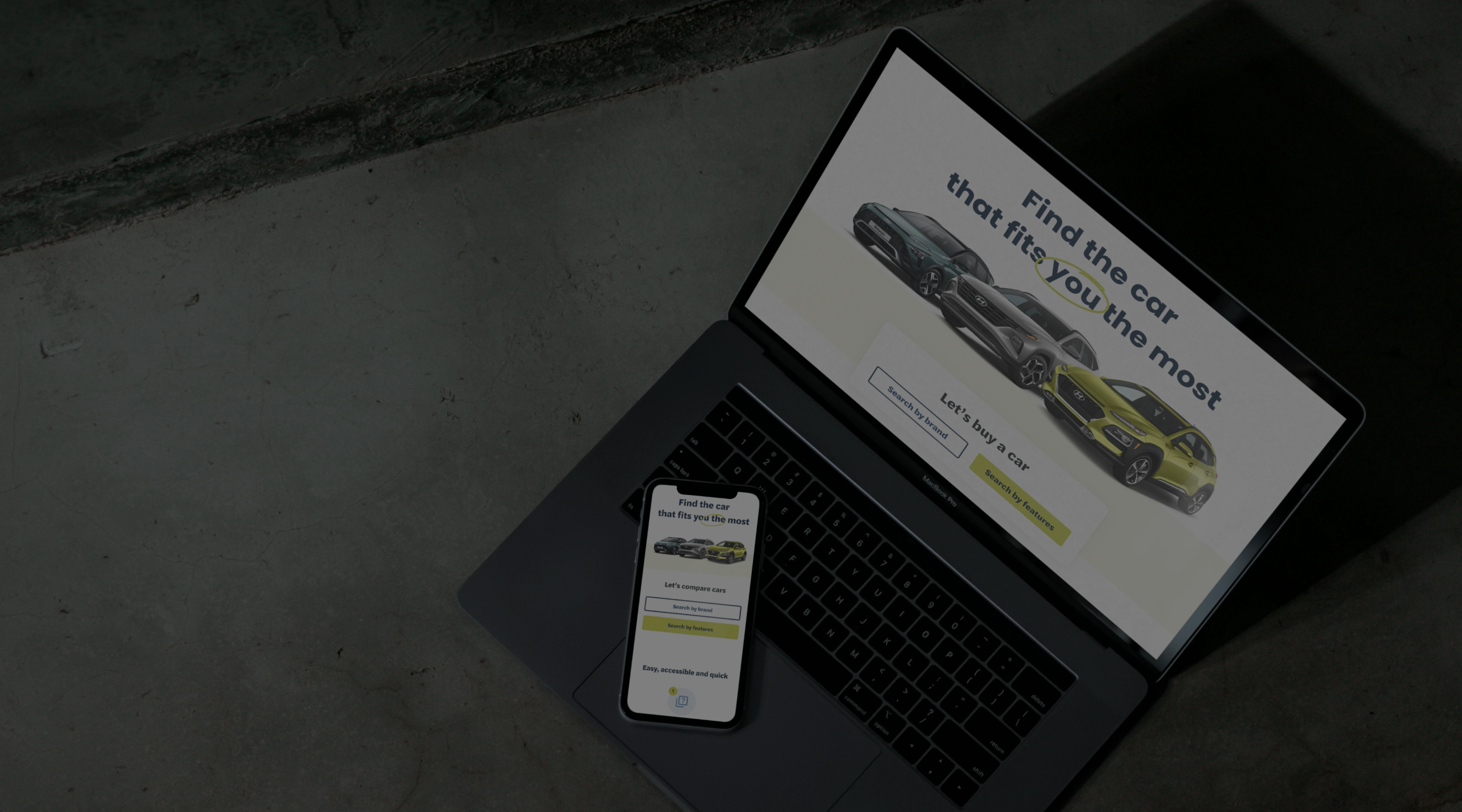
Autoselectr helps you find just the right car for you
Project Overview
A website that recommends and compares cars
Autoselectr is a car comparison platform designed for Portuguese users to find and evaluate vehicles based on their preferences. The MVP needed to serve two distinct audiences: those who already know the car they want, and those who are overwhelmed by too many options. I led the UX and UI design from scratch, including user research, UX flows, wireframes, visual design, and developer handoff.
The Problem
Car buyers are underserved when it comes to mobile-friendly car comparison platforms. Existing tools are clunky on mobile, often limit comparisons to two cars, and don't adapt to user knowledge levels. Autoselectr aimed to solve that by building a dual-experience comparison tool that works equally well for car enthusiasts and first-time buyers.
Research
Market & Competitor Research
We analyzed top car comparison sites and found consistent gaps:
- Most did not support 3+ car comparisons
- Mobile layouts were hard to navigate
- Forms were long and generic
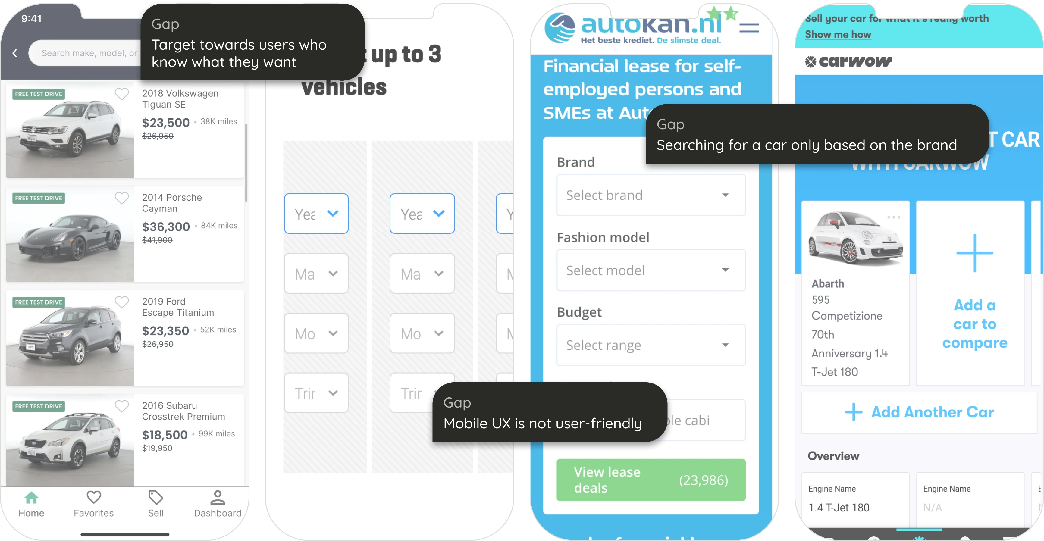
The competitors helped me identify gaps in the market as well as get inspiration for good practices
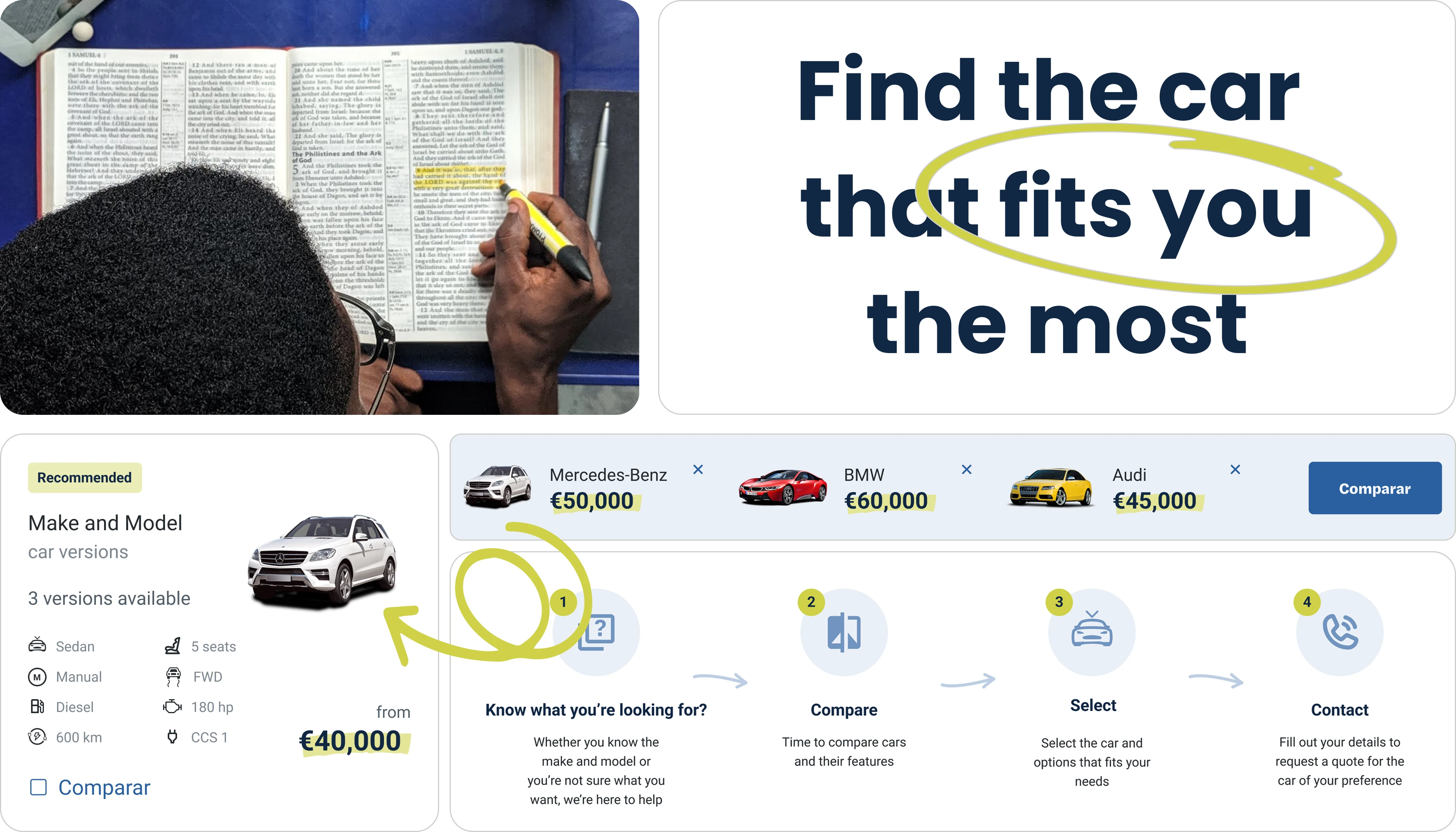
UX Strategy
To serve both groups, we designed two parallel user journeys:
- Option 1: Guided Wizard
For unsure users, we built a wizard-style questionnaire. Each screen focused on one decision, with visual aids and step indicators. - Option 2: Direct Comparison
For confident users, a linear form displayed all filters at once. This reduced friction and enabled faster submissions.
Collaboration
I worked closely with our Tech Lead to define which user attributes the algorithm needed, helping shape the structure of the questions and how data would be returned and filtered.
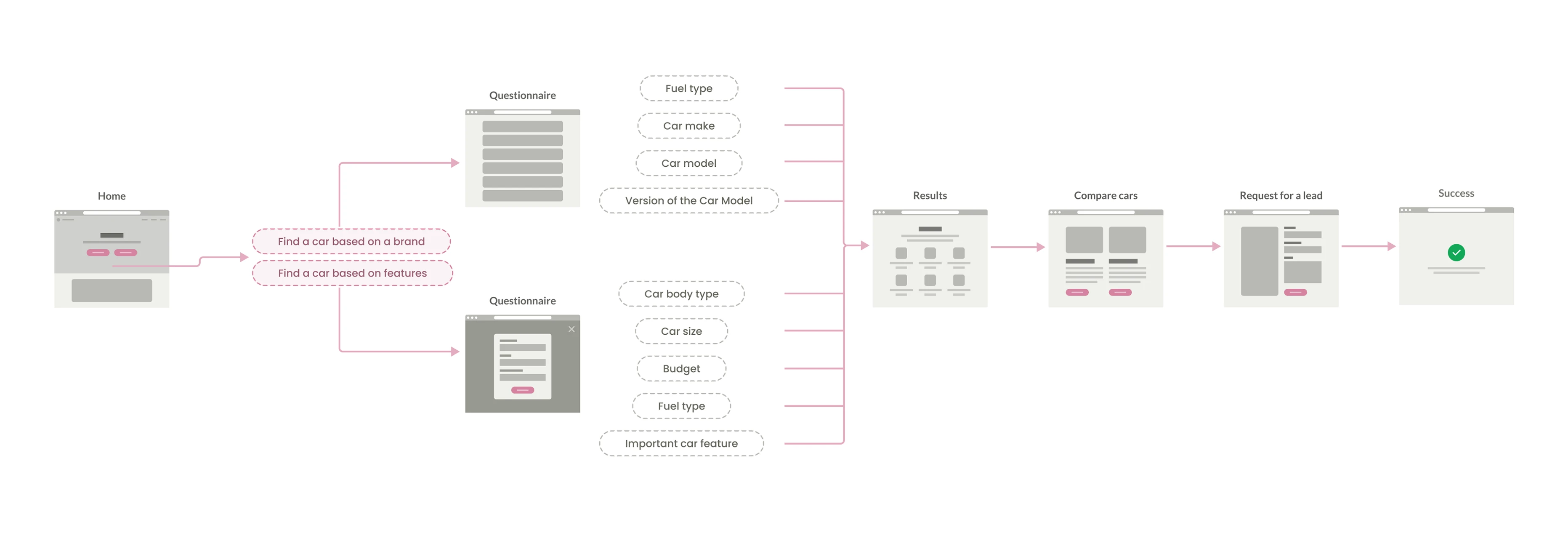
Creating a user flow that adapts to the needs of simple vs. advanced users
UI Design
Wireframing with Crazy 8s
I used the "Crazy 8s" method to quickly explore layout solutions for each major screen. Though not shared externally, this helped challenge obvious solutions and sparked creative layout directions.
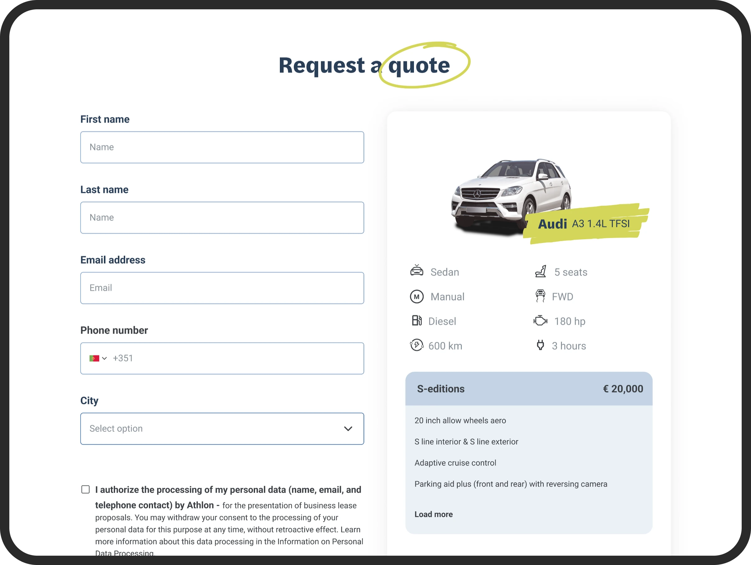
Form Design
- Wizard form was used for beginners, with one question per screen, clear navigation, and progress indicators.
- Linear form was optimized for experts to skim and complete fast.
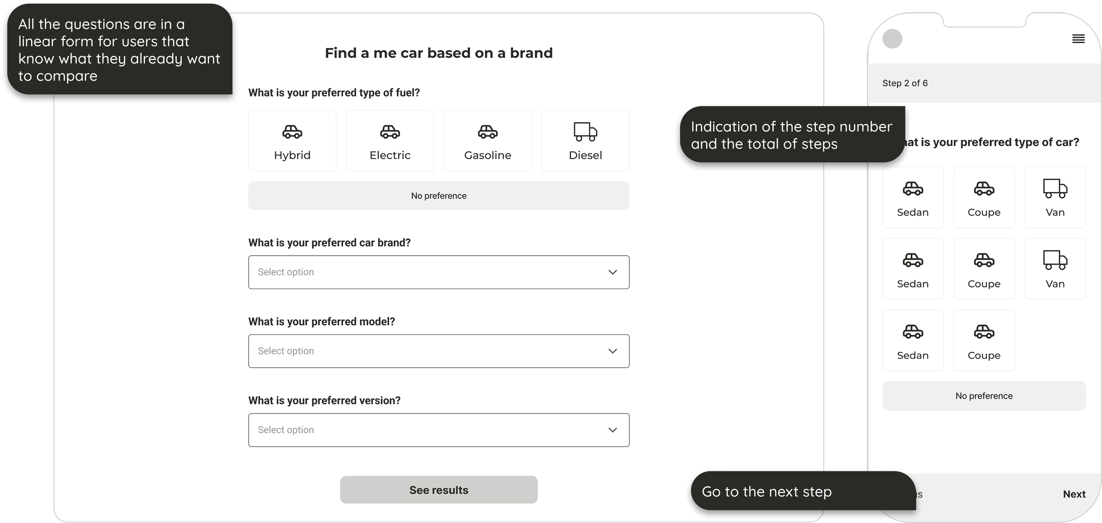
Due to the two distinct types of users, I needed to create two forms to support both user types
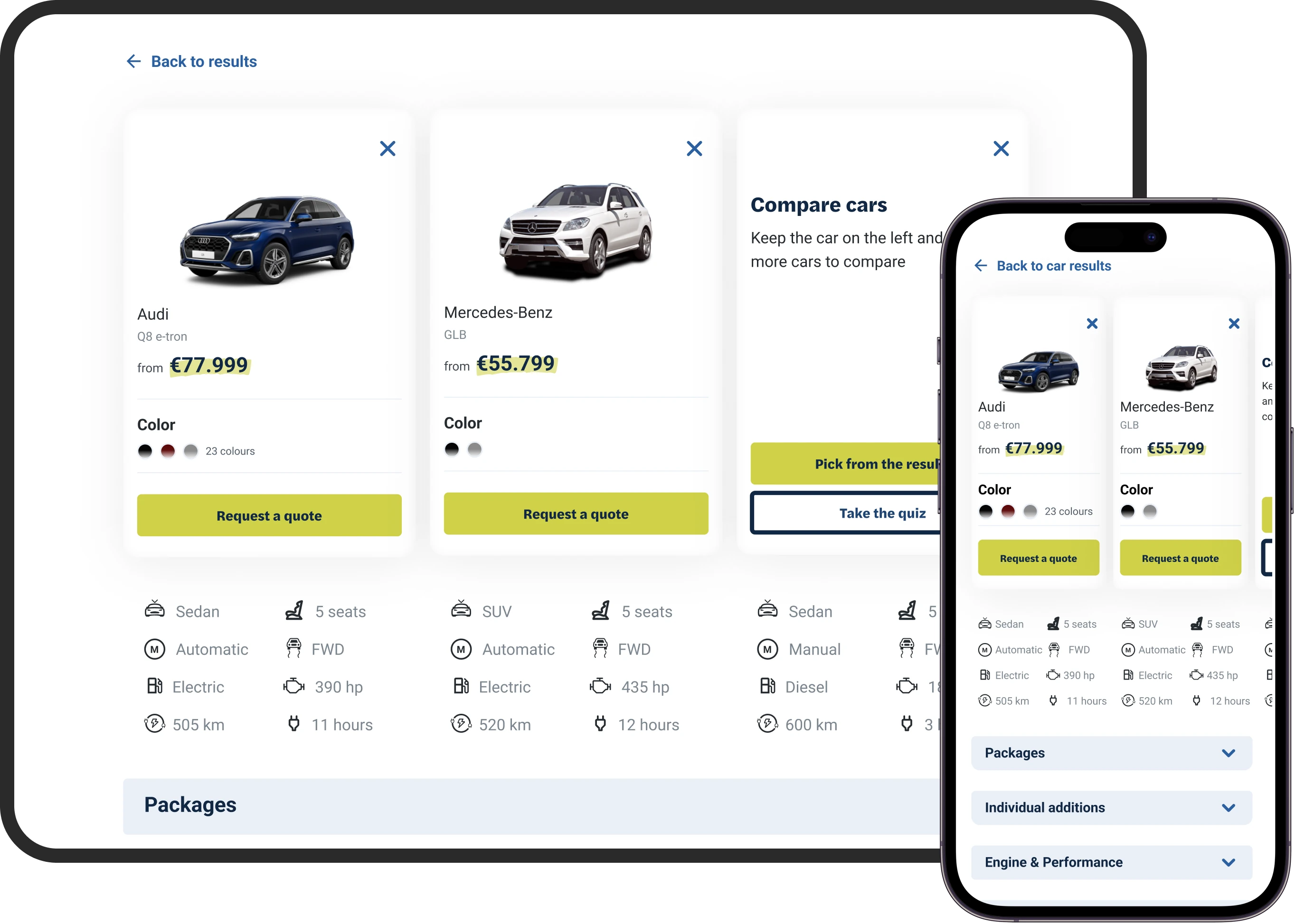
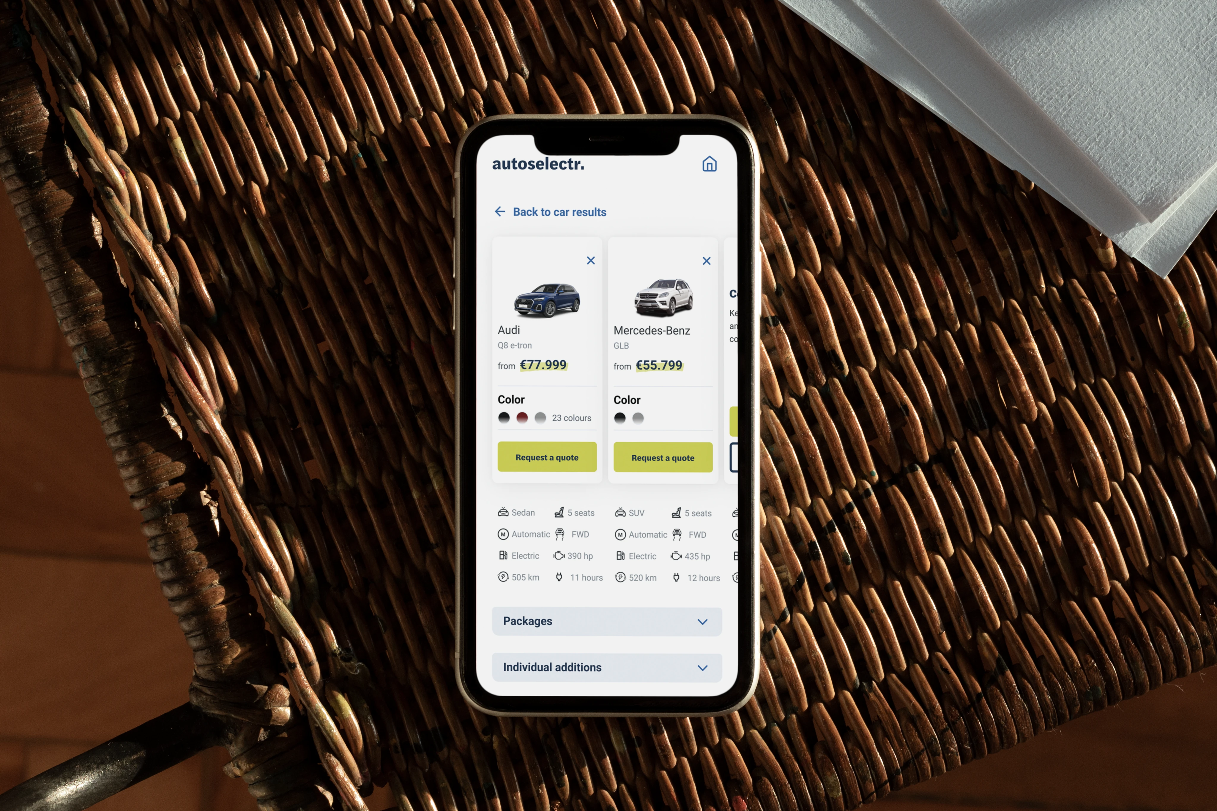
Car Comparison Page
This was the most technically and visually complex page in the product. Users could compare up to 3 cars, each with extensive specs.
Design Challenges:
- Fit large amounts of structured data into a mobile layout
- Keep group headers visible while scrolling
- Enable quick comparison across 3 vertical columns
UI Solutions:
- Horizontal scrolling for the 3rd car
- Sticky spec group titles for context
- Grouped and collapsible content blocks
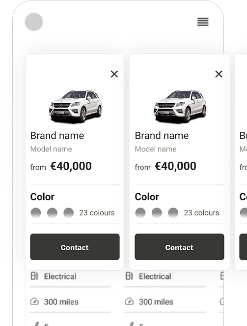
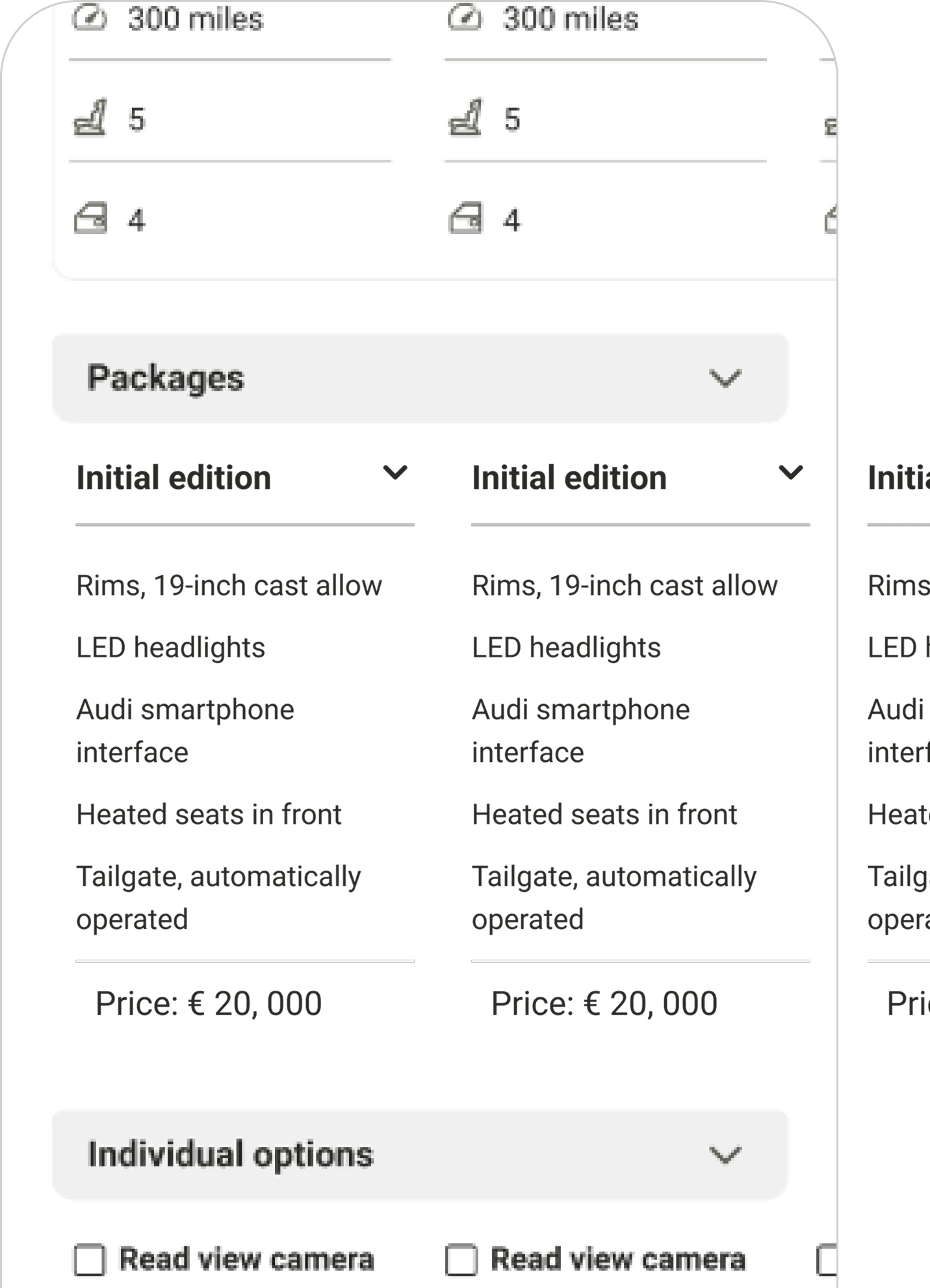
My next challenge was creating a scalable UI that can be used to compare 3 cars
Branding
Inspired by old classified newspapers and the act of "circling" car listings, I used a bold, highlight-style yellow to call out key user selections. To contrast, blue was used as the primary brand color to communicate trust and calm.
Accessibility
The entire palette was tested for accessibility contrast, and typography was selected to be both strong and readable.
Applying the palette to the elements across the UI
Applying the branding palette to the wireframes
As the project was in its initial states we had a limited amount of partners. This is the form for the non-partnered car companies
Developer Handoff
I created a comprehensive style guide with:
- Color and typography rules
- Reusable UI components
- States for buttons, cards, and forms
Using EightShapes Specs (pre-Figma Dev Mode), I generated annotated spacing and margin specs to ensure a smooth handoff.
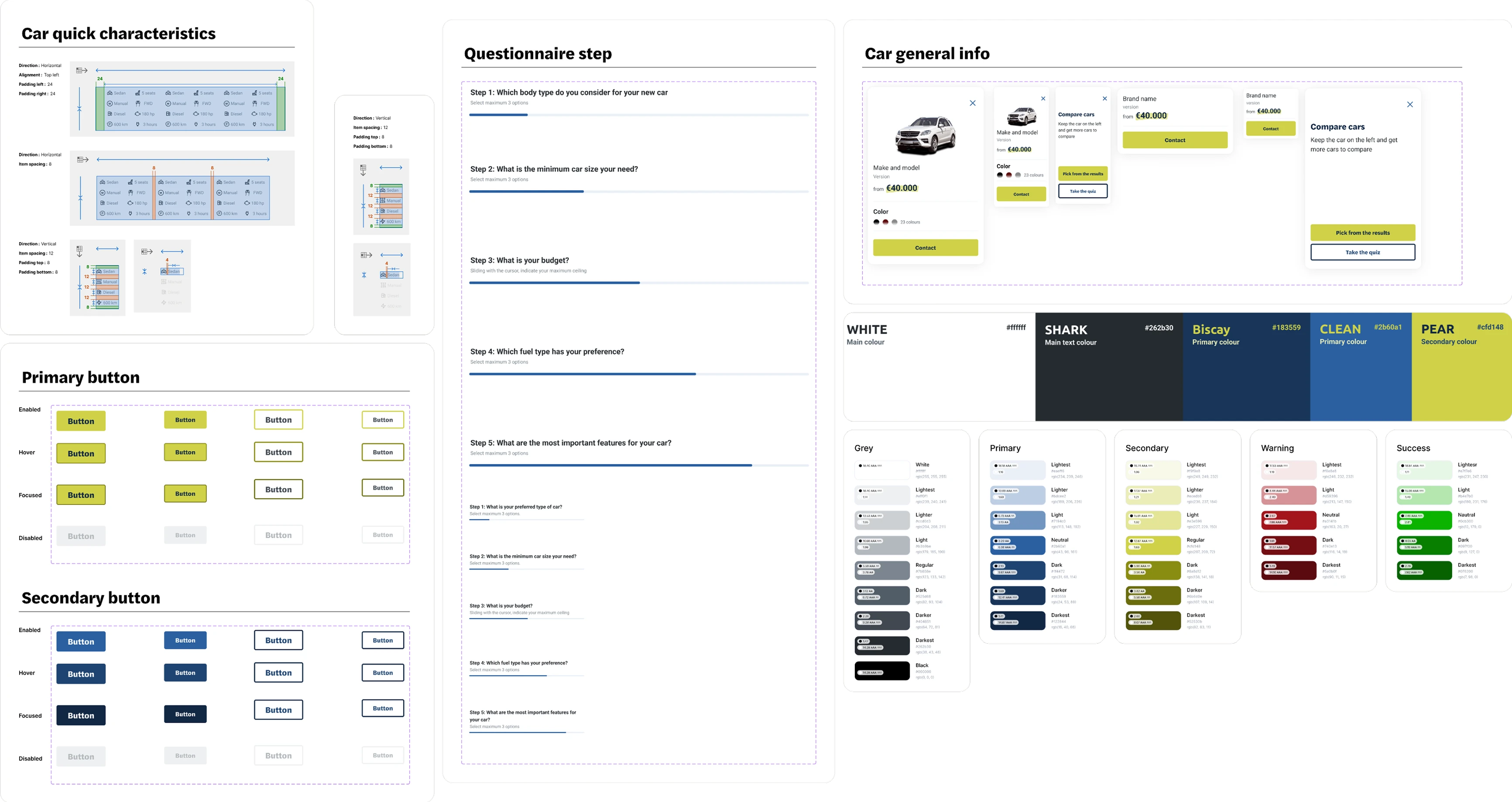
The generated styleguide so that I could perform a streamlined hand-off to the developers
Outcome & Reflection
Next Steps
- Run A/B tests comparing the two form flows
- Conduct usability testing for pain points in car comparison
- Add analytics tracking to see drop-offs and conversions
Final Thoughts
This was my first end-to-end client project including branding, UX flows, visual design, and developer handoff. The client accepted the MVP without revision, and we're currently moving into testing with users.