VRM: Managing the advanced data of our installation
Project Overview
The VRM portal is Victron Energy's global platform for remotely monitoring off-grid and mobile energy installations. These installations are often located in remote areas, making accurate and readable data crucial for device maintenance and troubleshooting.
The Advanced Page is one of VRM's most powerful and most complex areas, containing dozens of widgets, multi-variable graphs, and system summaries. Over the years, the page became hard to scan, hard to configure, and visually inconsistent, especially for users managing many devices.
My task
Identify the core UX issues with the Advanced Page and redesign it into a clearer, more accessible, and more user-centred experience, without disrupting long-time power users who rely on it daily.
The Problem
Internal teams, community users, and the product owner all surfaced the same challenges:
Usability Issues
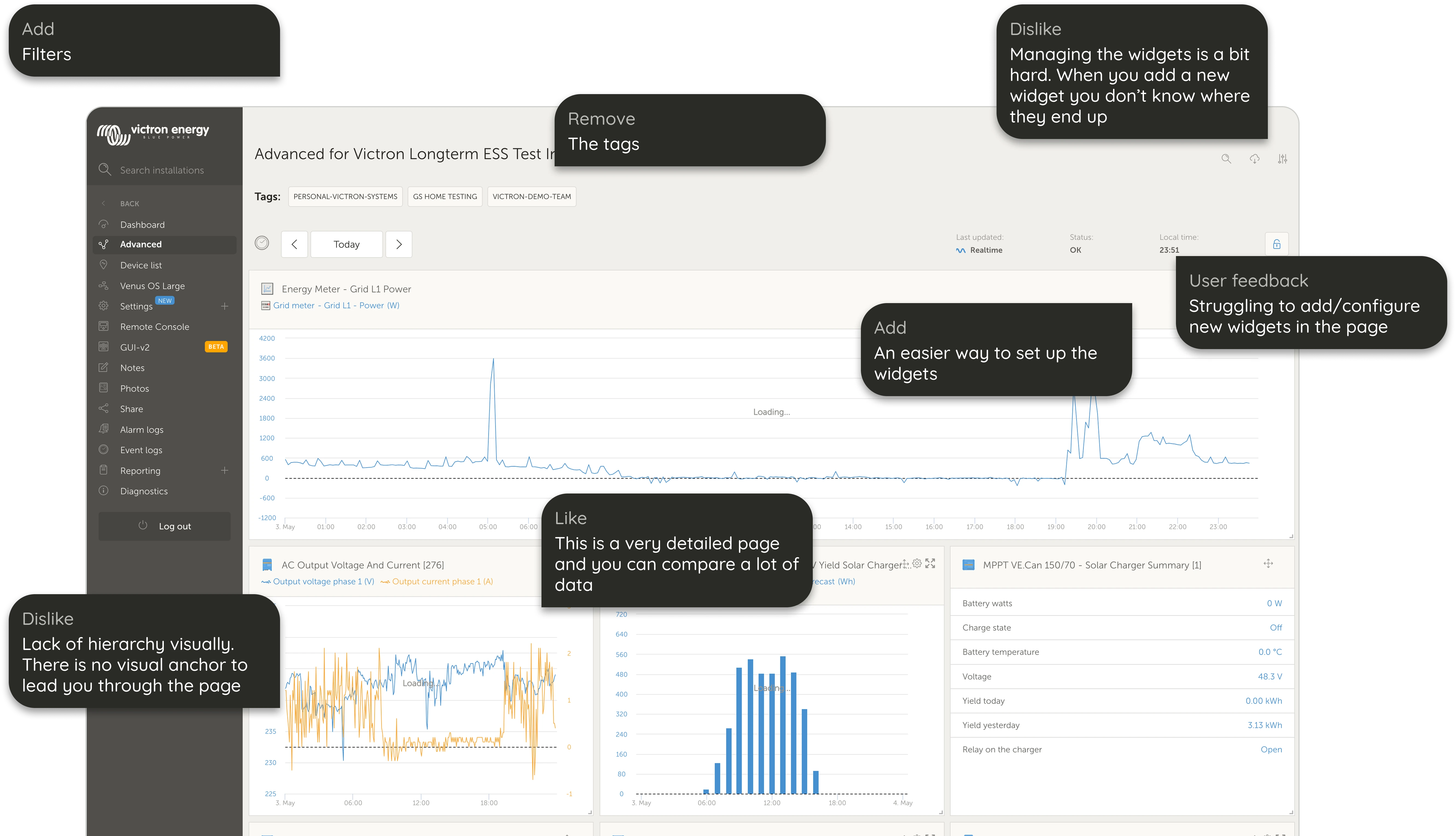
- Users struggled to understand the hierarchy of widgets due to the page lacking a visual anchor.
- When a new widget was added, users couldn't find where it appeared.
- Widget management felt unpredictable and required unnecessary scrolling.
- The page had grown visually inconsistent with VRM's dashboard, breaking mental models.
Accessibility & UI Issues
- Low-contrast text and colored labels made reading difficult.
- Small touch points and unclear spacing impacted usability.
- Inconsistent use of color, tags, and iconography added cognitive load.
Functional Limitations
- No ability to compare two date ranges within a widget.
- No single-value widgets for quick scanning.
- No way to group multiple widgets for large installations.
These issues directly reduced efficiency for a very advanced, detail-oriented user group who rely on VRM for daily system management.
Research
Understanding Our Users
VRM's users are highly experienced, data-literate, and often long-time system owners. They frequently share frustrations and ideas in VRM's community forum. Their expectations are high, and they rely heavily on precise system data to make critical decisions.
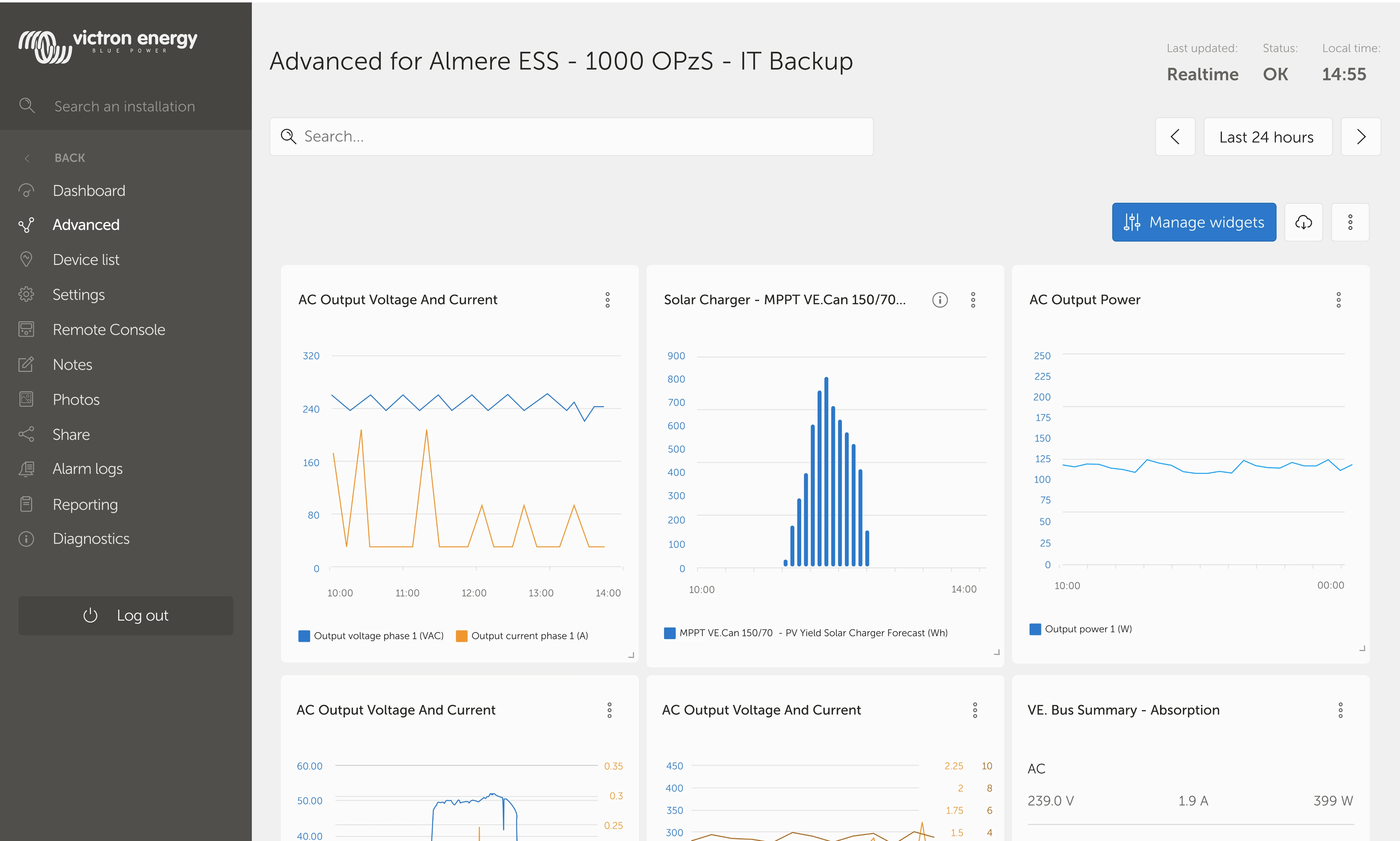
Before
After
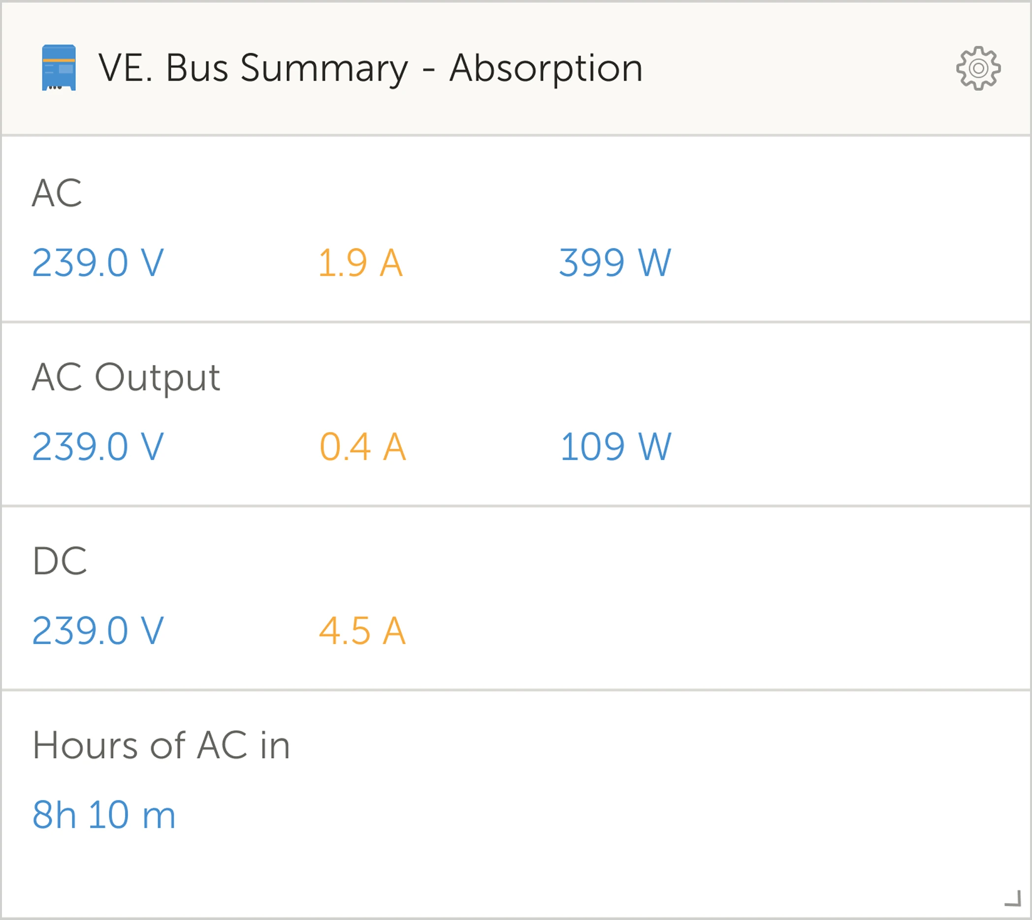
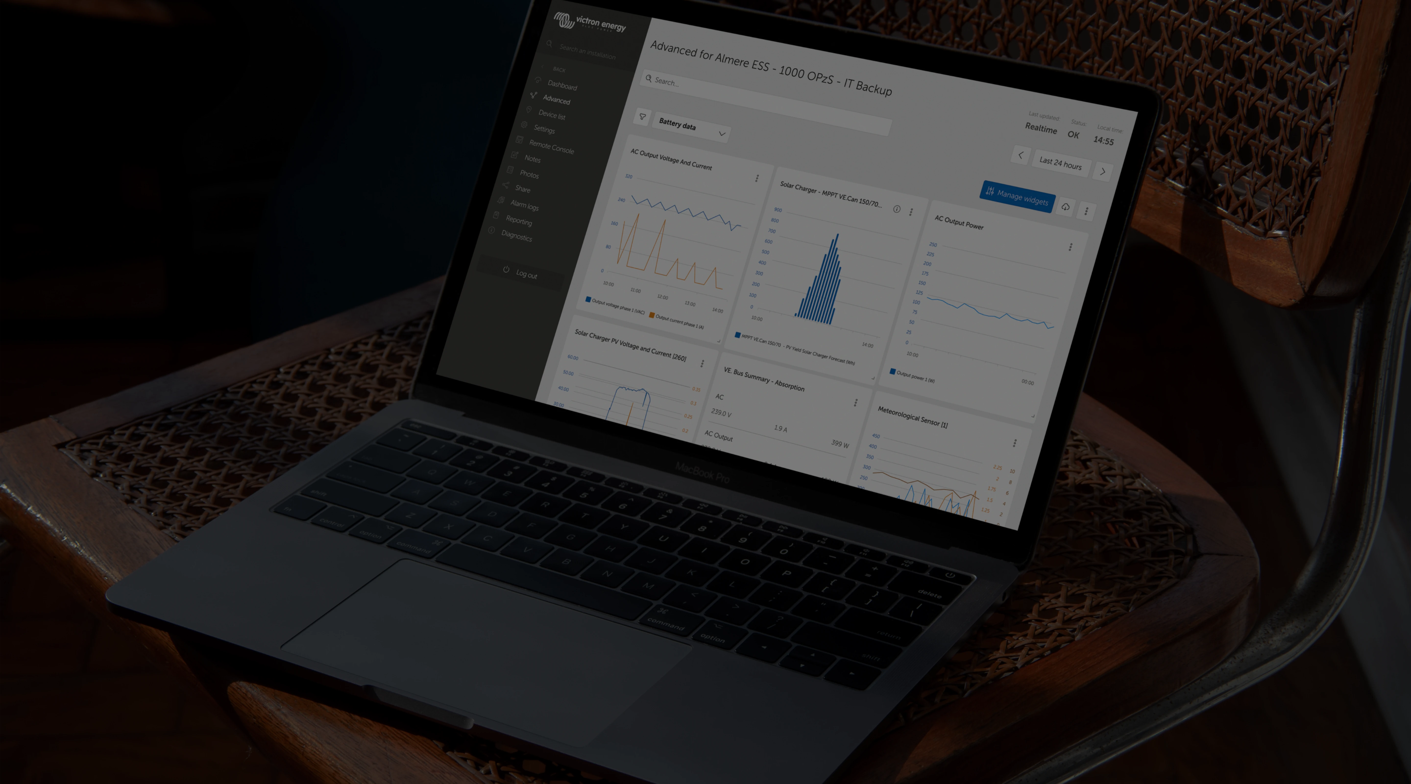
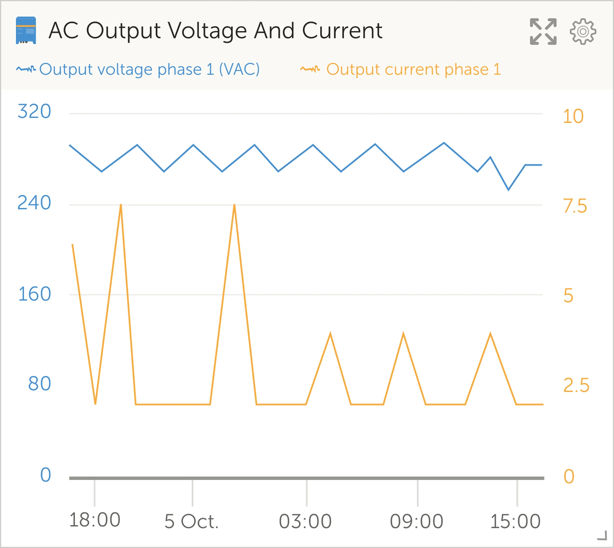
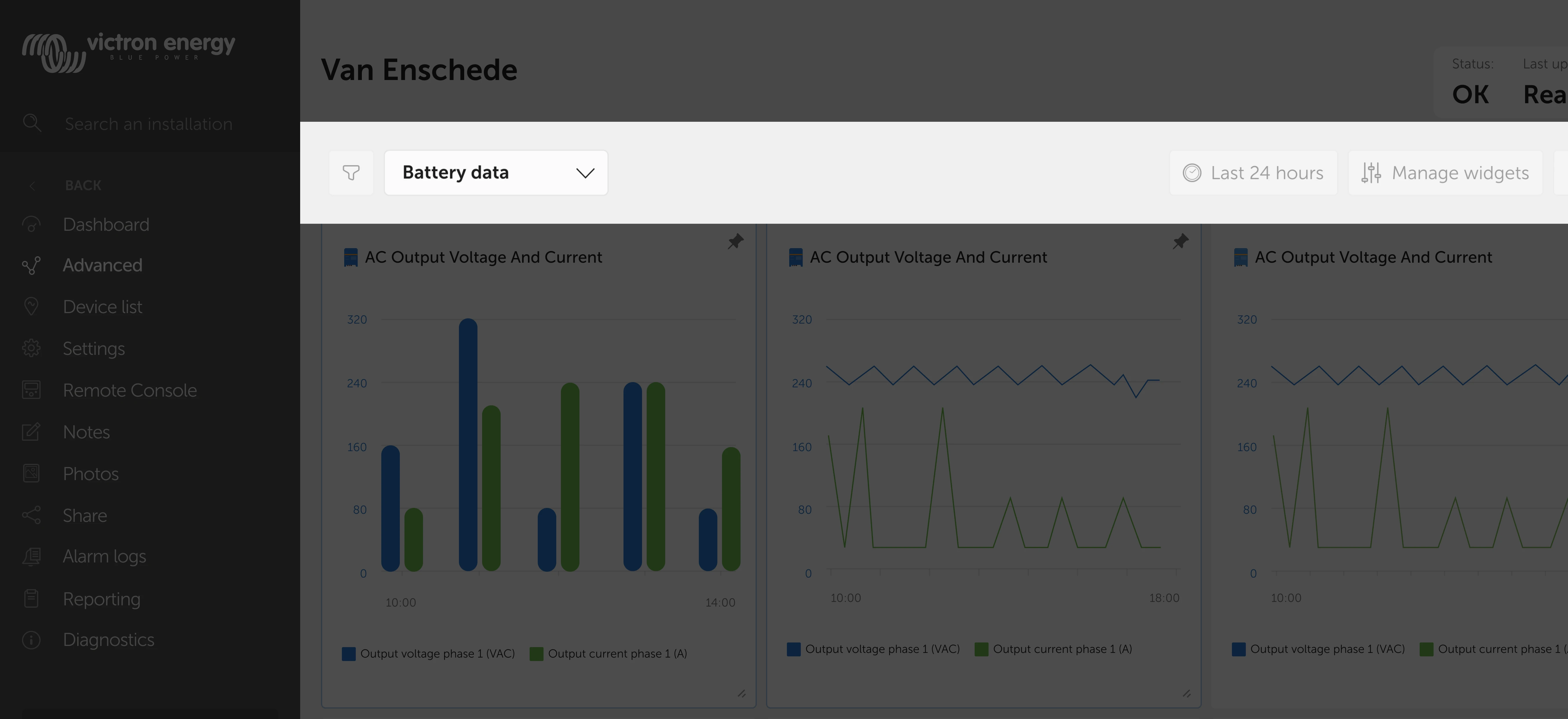
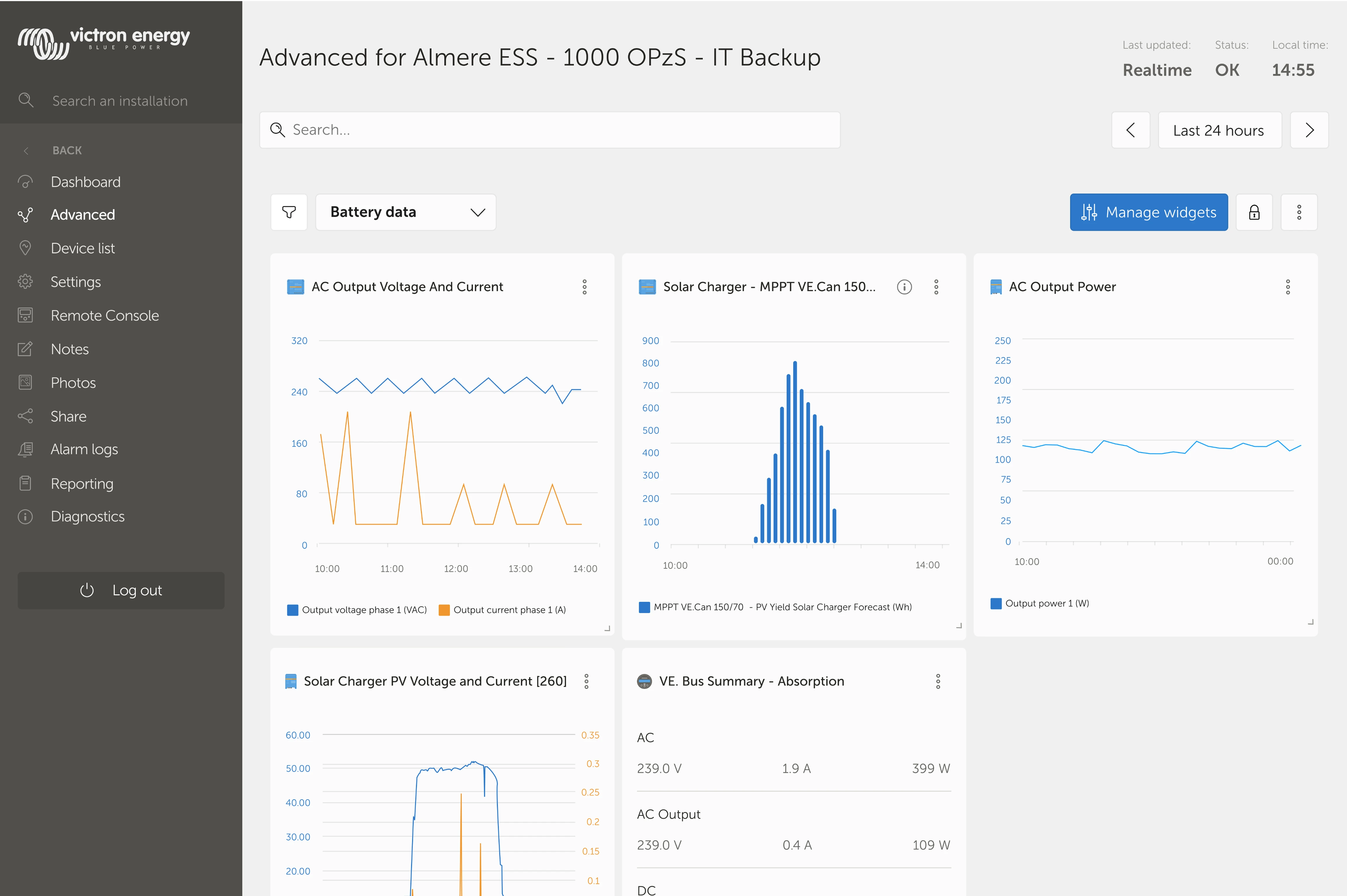
The widgets vary from detailed graphs to summaries of multiple variables
Internal Interviews
I interviewed five internal stakeholders (UX, developer, marketeer, and IT advisor). Each walked through the Advanced Page live to explain:
- What frustrates them
- What confuses users
- What slows users down
- What features users request most
After synthesizing their notes, a few themes became clear:
Top Pain Points (Grouped Themes)
Visual clarity
- "There is no visual anchor on the page."
- "The hierarchy is unclear."
Widget management
- "Managing widgets is a bit hard."
- "When you add a new widget you don't know where it ends up."
Missing functionality
- "Users want to compare two date ranges."
- "Users want simpler or single-value widgets."
- "We need an easier way to group widgets."
Inconsistencies
- Dashboard and Advanced Page use different visual languages.
This research confirmed
The problem wasn't the data, but rather the structure around the data.
The internal interviews showed many elements that required attention.
Prioritisation (MoSCoW)
To align the team, I translated insights into a MoSCoW list:
Must Have
- Remove unnecessary tags
- Add clear visual hierarchy
- Improve widget management clarity
- Align visual style with Dashboard
Should Have
- Pin widgets
- Allow two date ranges in custom widgets
- Single-value or text-only widgets
- Combine two graphs for easier comparison
Could Have
- Jump-to interactions
- Toggle view between full-width and compact cards
Will Not Have
- Drag-and-drop saved across sessions
- More detailed summary widgets
This prioritisation ensured focus on high-impact usability improvements.
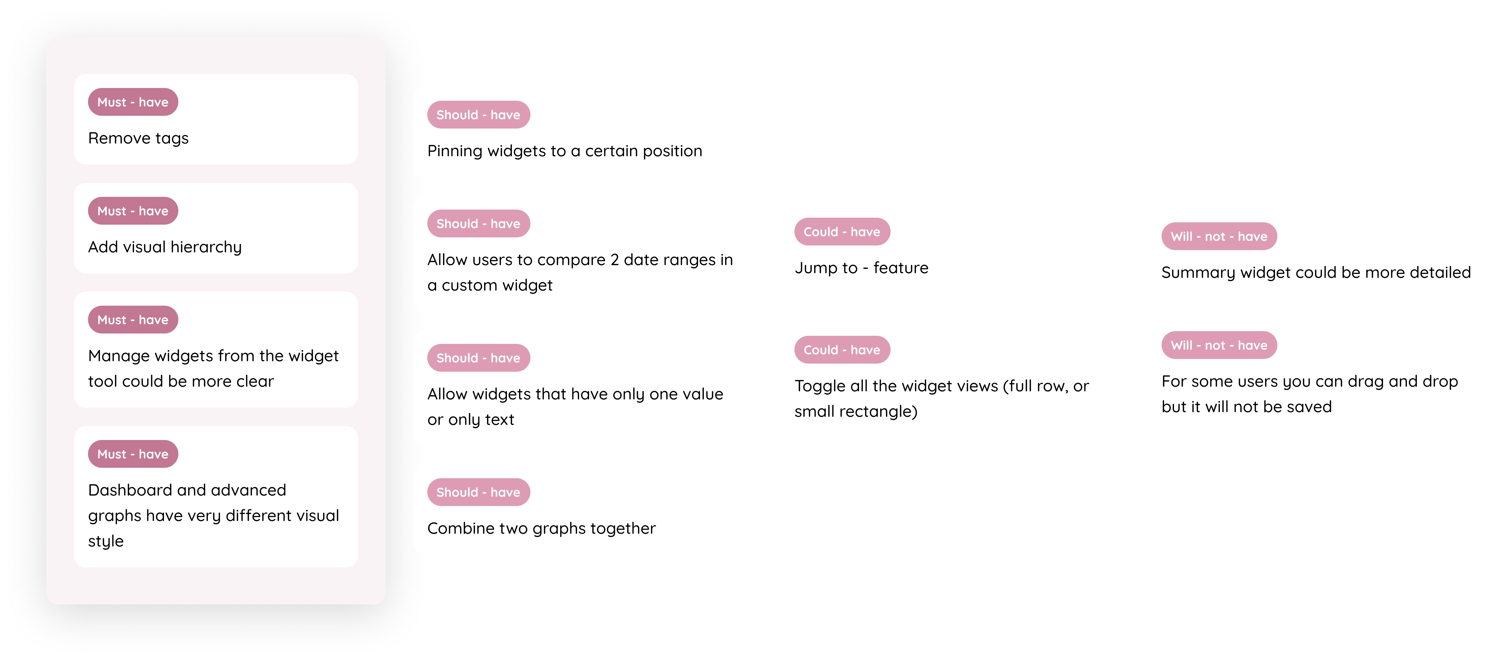
The MoSCoW method generated insights on the feedback from the internal interviews
UX Problems Identified (Before)
During my audit, I found several key issues:
Visual & Hierarchy Issues
- Inconsistent graph styles across pages
- Overuse of colored tags
- Lack of spacing rules
- No clear visual path guiding users
- Low contrast and accessibility violations
Interaction Issues
- Hard to understand where new widgets appear
- No grouping system for long pages
- Comparing values across graphs required too much cognitive effort
These insights shaped the foundation of the redesign.
Design Solutions
Improved Visual Hierarchy & Accessibility
I redesigned widgets with:
- Higher contrast text
- Larger touch areas
- Consistent spacing
- Clearer structure between widget types
- Unified visual system matching the Dashboard
This immediately made scanning easier, especially for large installations.
Before

After
The widgets required attention to get a cleaner and more accessible redesign
Before
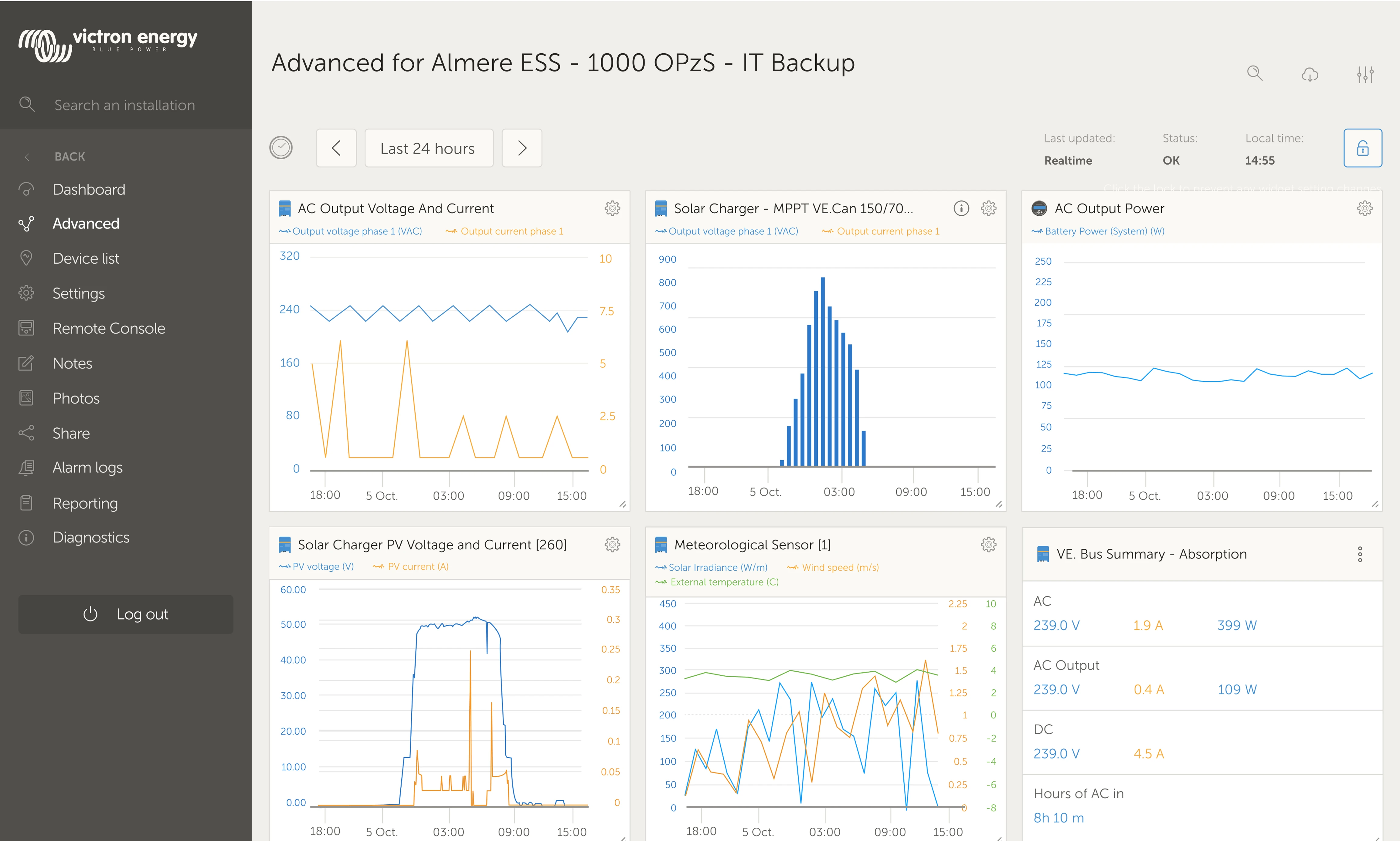
After
The Advanced page was brought in line with the rest of the graph-related pages
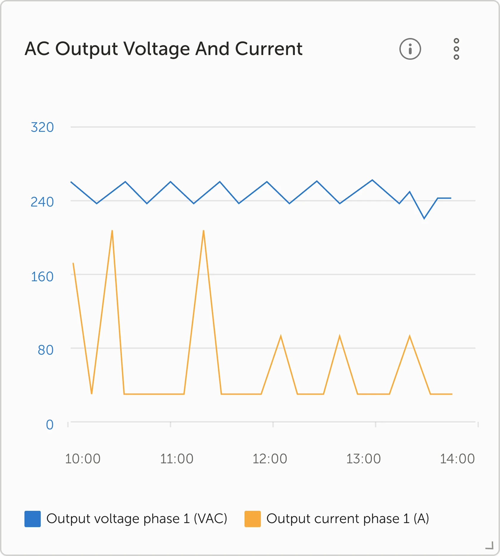
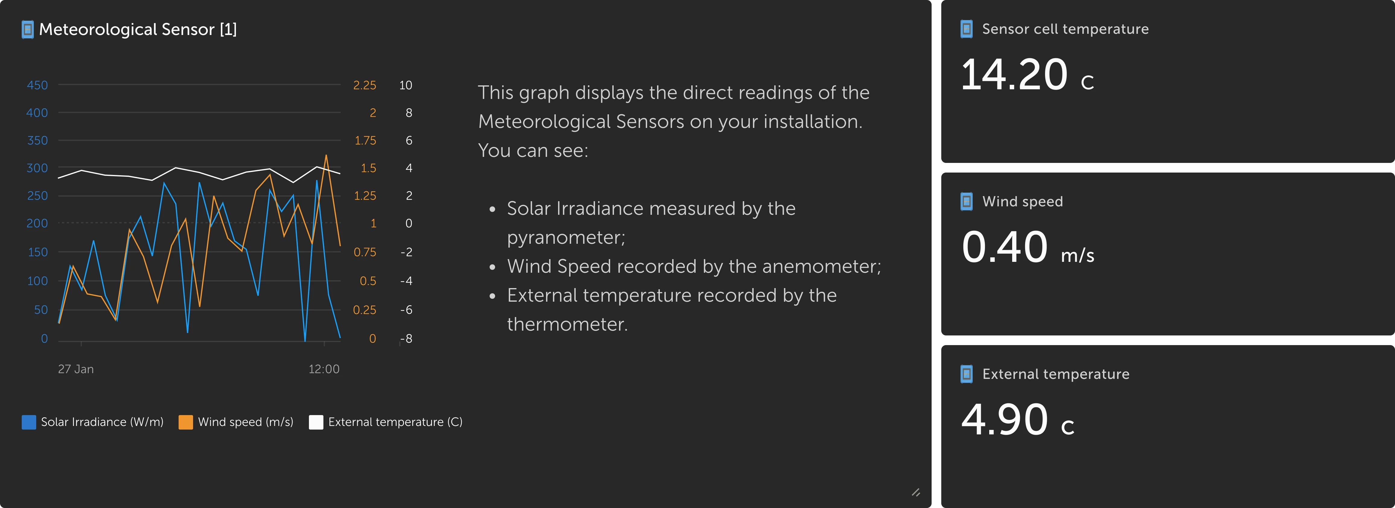
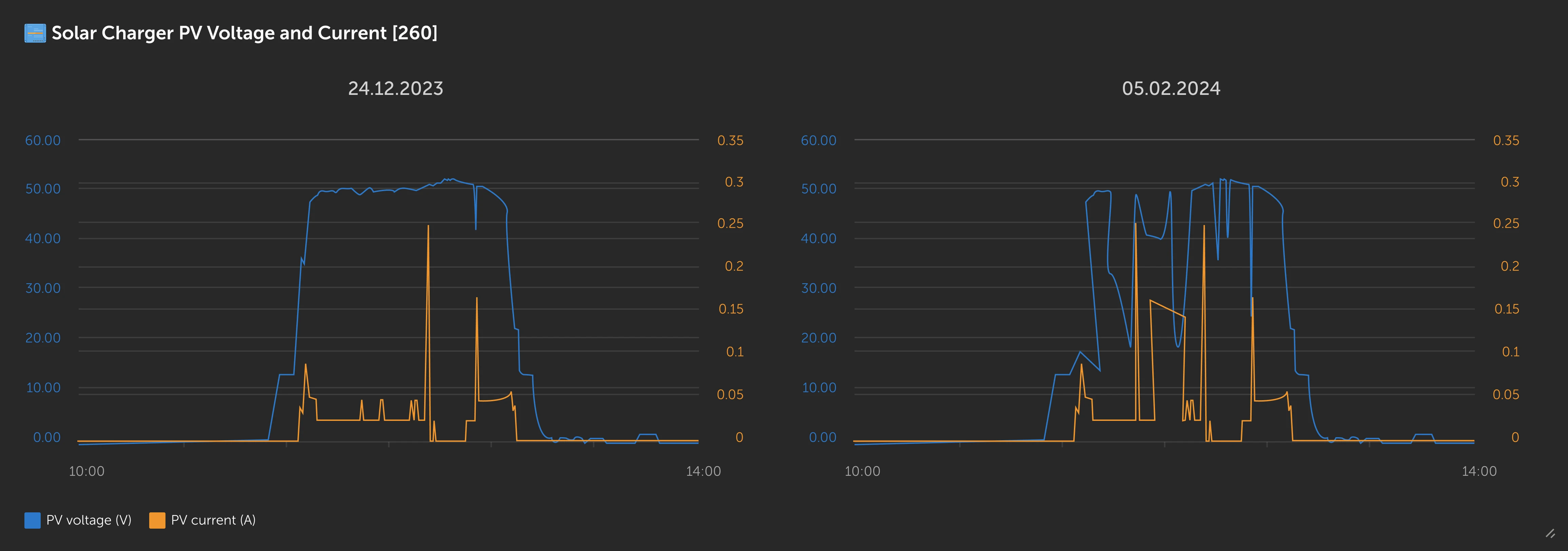
New Widget Types for Better Comparison
To support different user needs, I introduced:
- Single-value widgets for fast scanning
- Widgets with descriptions for clarity
- Two-date comparison widgets
- Combined widgets for multi-variable graph comparison
These additions reduced cognitive load and improved data interpretation speed.
Adding a description on a widget
Comparing two dates
Combined multiple widgets into one
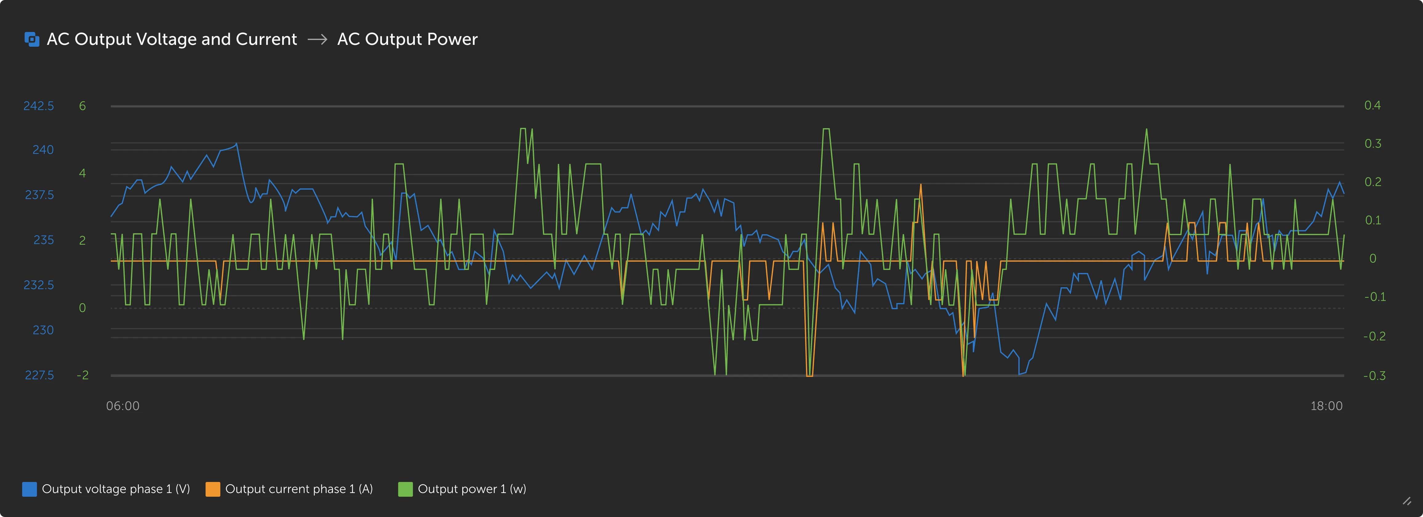
New widget options were added to facilitate for the need of extra comparison functionalities
Widget Grouping System
- Administrators can now create categories to organize widgets
- This reduces scrolling and helps users working with very large systems
Grouping of widgets allows administrators to easily manage multiple installations
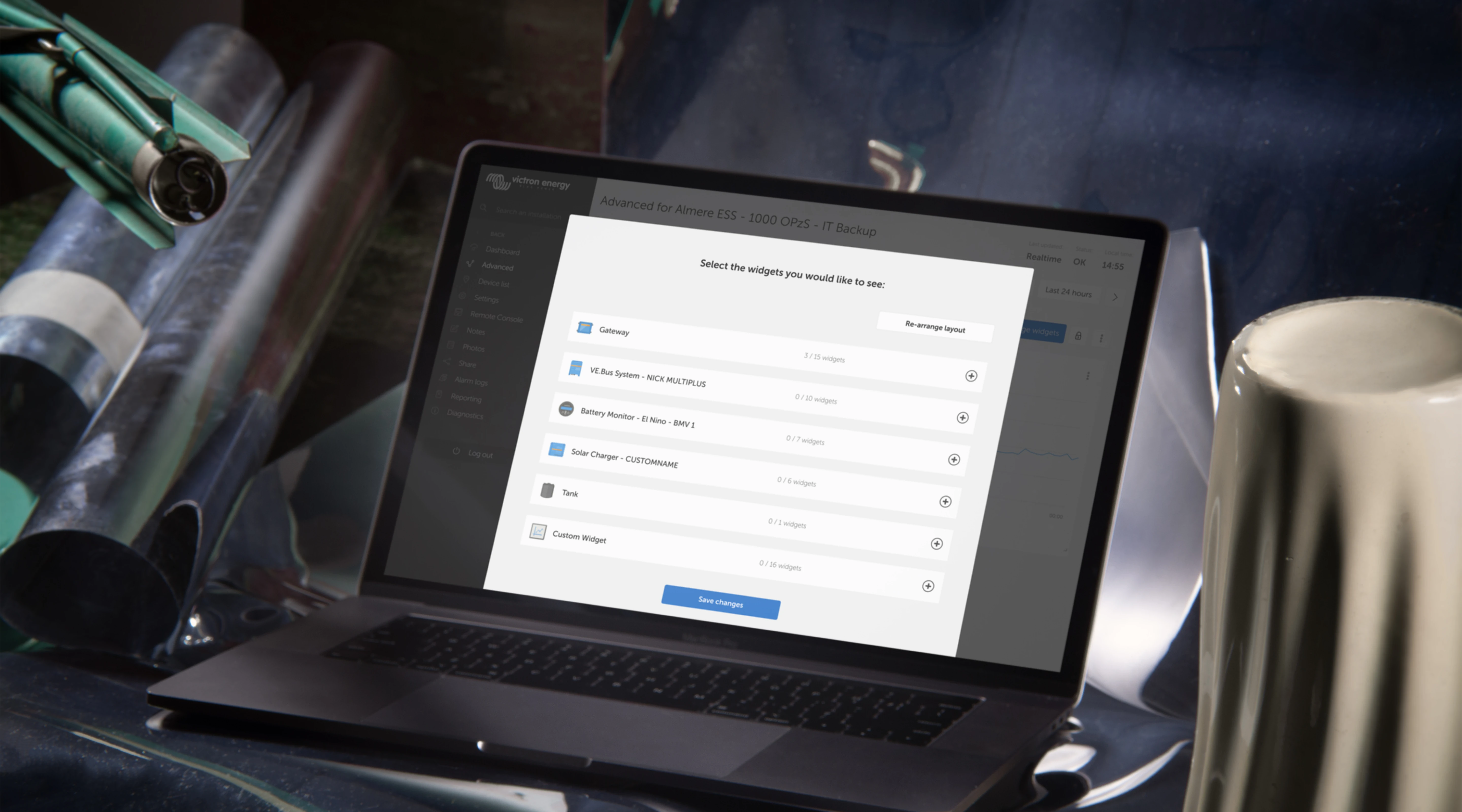
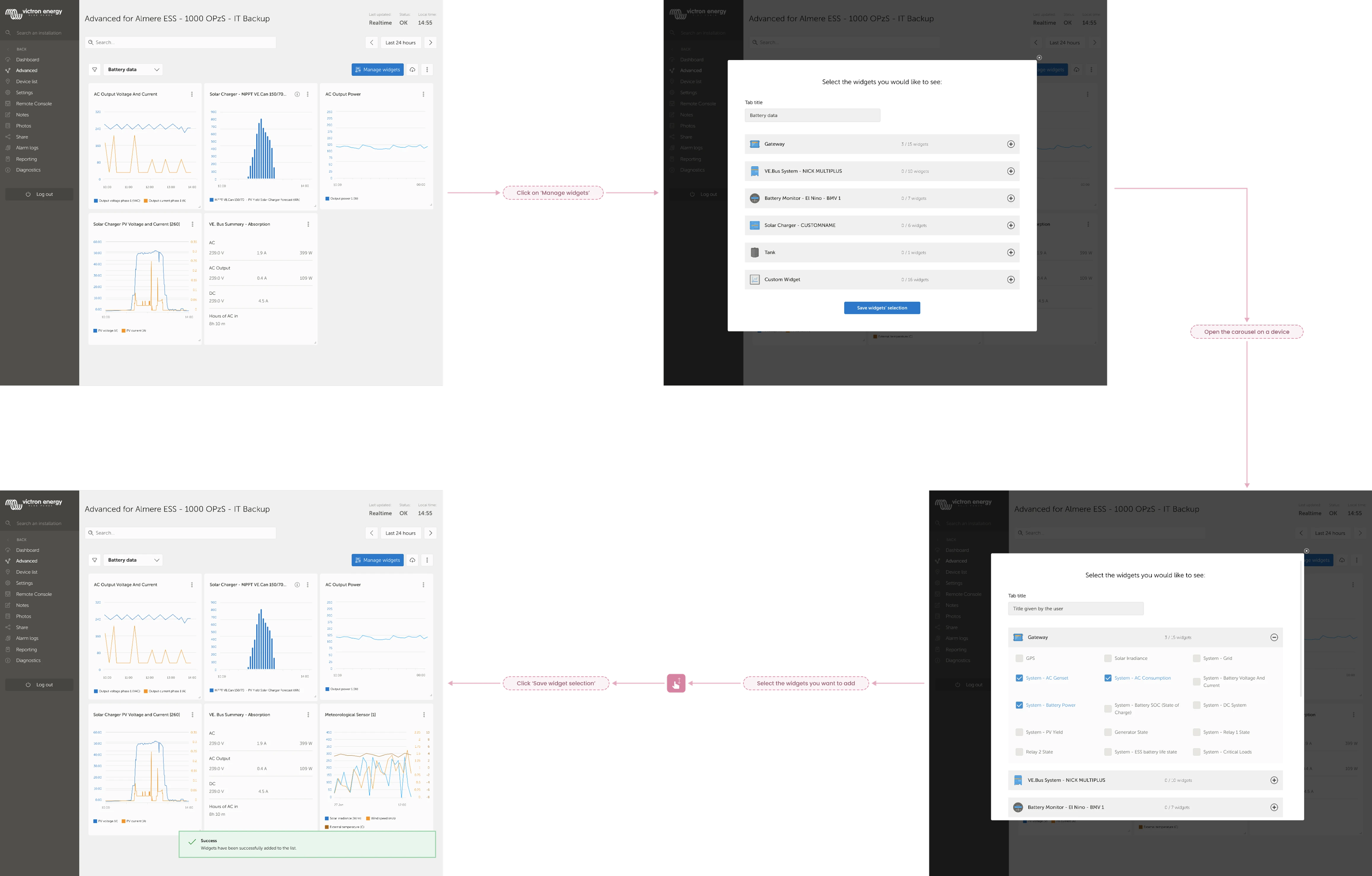
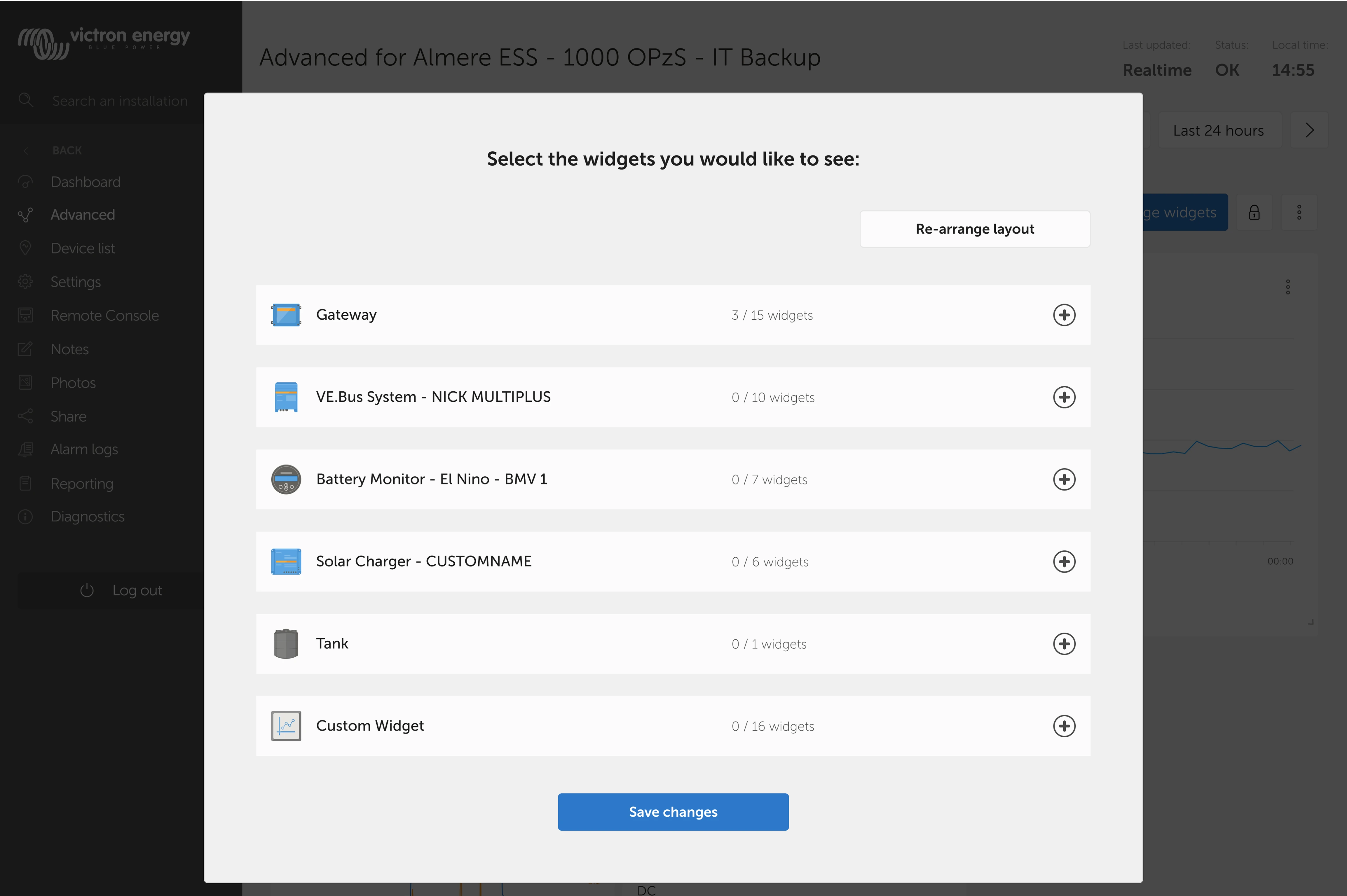
Redesigning Widget Setup: Two UX Flows
To solve the biggest usability complaint, I designed two flows:
Option 1: Simple modal
- Select/deselect widgets
- Newly added widgets appear at the bottom
Option 2: Advanced editor
- Add widgets
- Rearrange
- Resize before saving
Both options were designed for testing and discussion.
Option 1
Simple modal where you select and deselect widgets. A new widget is added in the end.
Option 2
Select the widgets you want to add but also arrange and resize them before saving
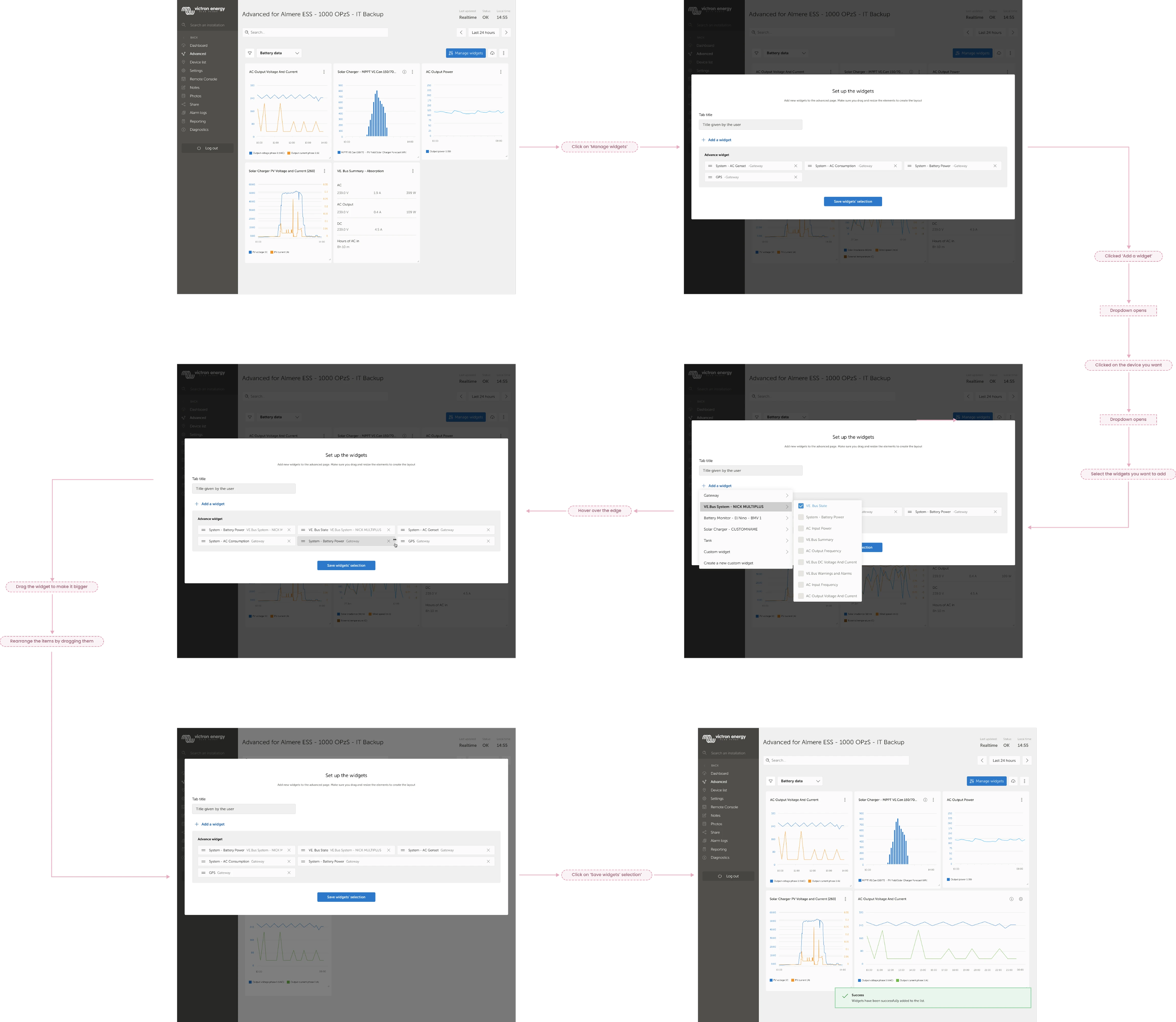
Simple and advanced user flows for setting up the Advanced page
Focus Group Validation
I ran a controlled focus group with the same internal experts. They reviewed the updates and tested the two new flows.
Key Feedback
- Keep the header icons since they help users recognise widgets
- Keep the lock icon since it prevents unwanted reordering
- Search & filter combination is powerful
- Option 1 feels more intuitive
- Option 2 is helpful for layout planning
Final Decision
I combined Option 1 and Option 2 into a modern hybrid flow:
- Add widgets from a simple modal
- Immediately adjust layout before saving
This preserved simplicity while empowering advanced users.
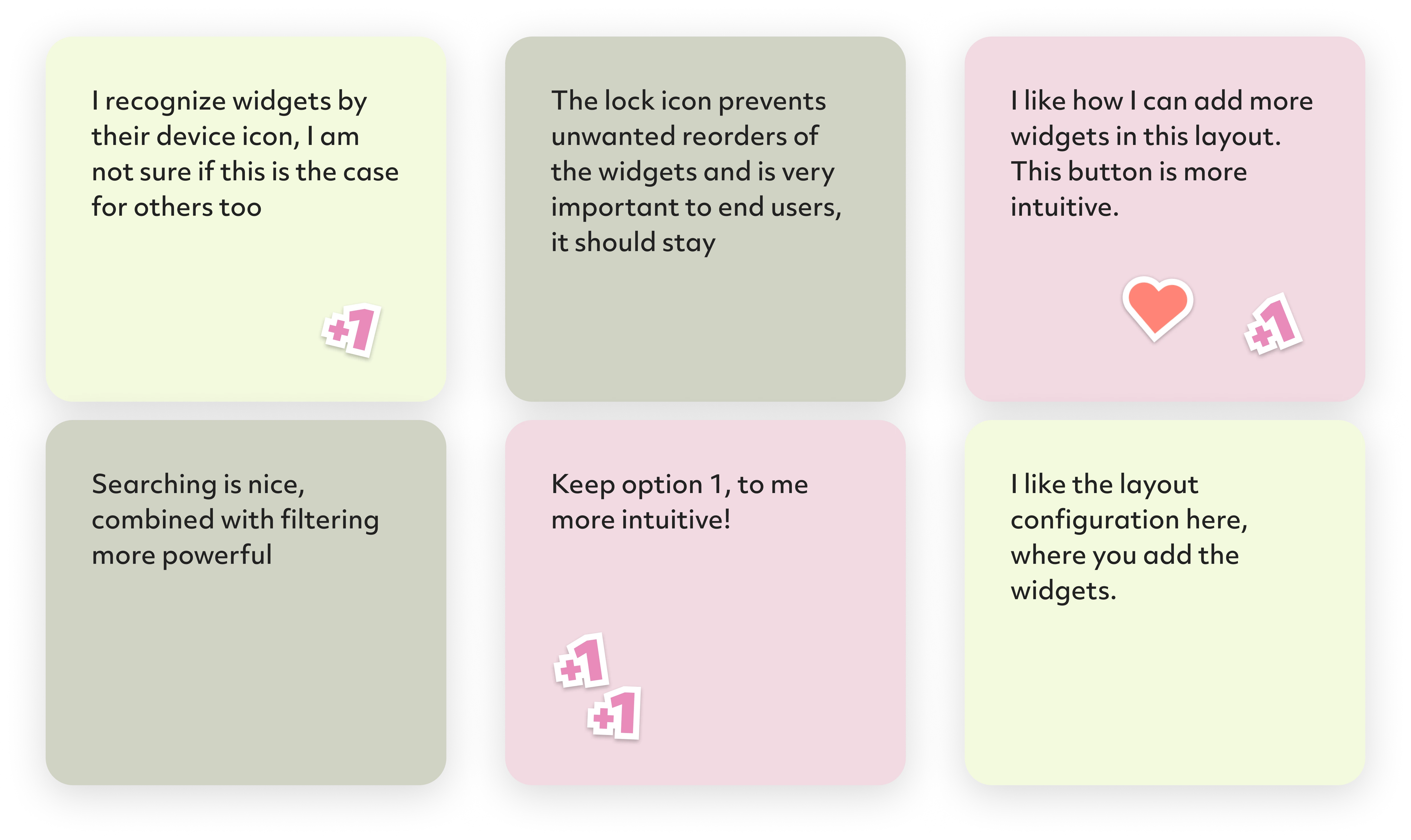
The focus group gave me further opinions, feedback and features to adapt in the design
Some elements that the focus group participants still deemed unnecessary
The two user flows for creating a widget were combined into one
Final Experience
The redesigned Advanced Page now has:
- Clear visual hierarchy
- Accessible, consistent UI
- Widget grouping system
- Flexible widget types
- Combined add-and-configure flow
- Alignment with the Dashboard look & feel
Together, these changes create a cleaner, more usable, and more scalable experience for the entire VRM user base.
Outcome & Reflection
Next Steps
- Present updated designs to the client for validation
- Redesign edge cases and error states
- Prepare full UI specifications for developers
- Explore how to support saving layouts across sessions
Final Thoughts
This project required:
- Deep investigation into expert user behaviour
- Translating fragmented feedback into clear UX priorities
- Designing within a legacy system without breaking user habits
- Solving complex interaction patterns around data comparison and widget configuration
- Staying detail-oriented while creating scalable, accessible UI components
Ultimately, this case study demonstrates my strength in identifying usability issues, synthesizing complex input, and delivering thoughtful, user-centred solutions backed by process and rationale.