
Vota: Applying accessibility to create a universal design
Project Overview
Creating a Universal Design through Accessibility
Vota is an online job platform for secondary education institutions in the Netherlands. It centralizes vacancies across six school boards and matches candidates based on skills and preferences. The client provided a modern visual redesign for their landing pages, which needed to be evaluated and corrected for accessibility.
My task
Transform this visually inconsistent and non-compliant design into a universal, accessible, and scalable interface, one that meets WCAG standards and serves users of all abilities.
The Problem
The provided design looked sleek but had major accessibility and usability issues:
- Color contrast failed WCAG guidelines
- Navigation was cluttered and illogical
- Text hierarchy was unclear and all-caps headings impaired readability
- Buttons and links lacked clarity and had low discoverability
- No consistent grid system existed for scalability
These issues risked excluding users with visual, cognitive, and motor impairments, as well as those with situational limitations like mobile users or older adults.
My Objectives
- Identify and resolve all WCAG 2.1 AA accessibility violations
- Improve UI hierarchy using visual design best practices
- Make the interface touch-friendly and screen-reader compatible
- Establish a scalable layout using a grid system
- Begin creating a visual system for future components
Key Accessibility Issues

Testing the accessibility presented multiple issues with contrasting colours, complex navigation and small target points.
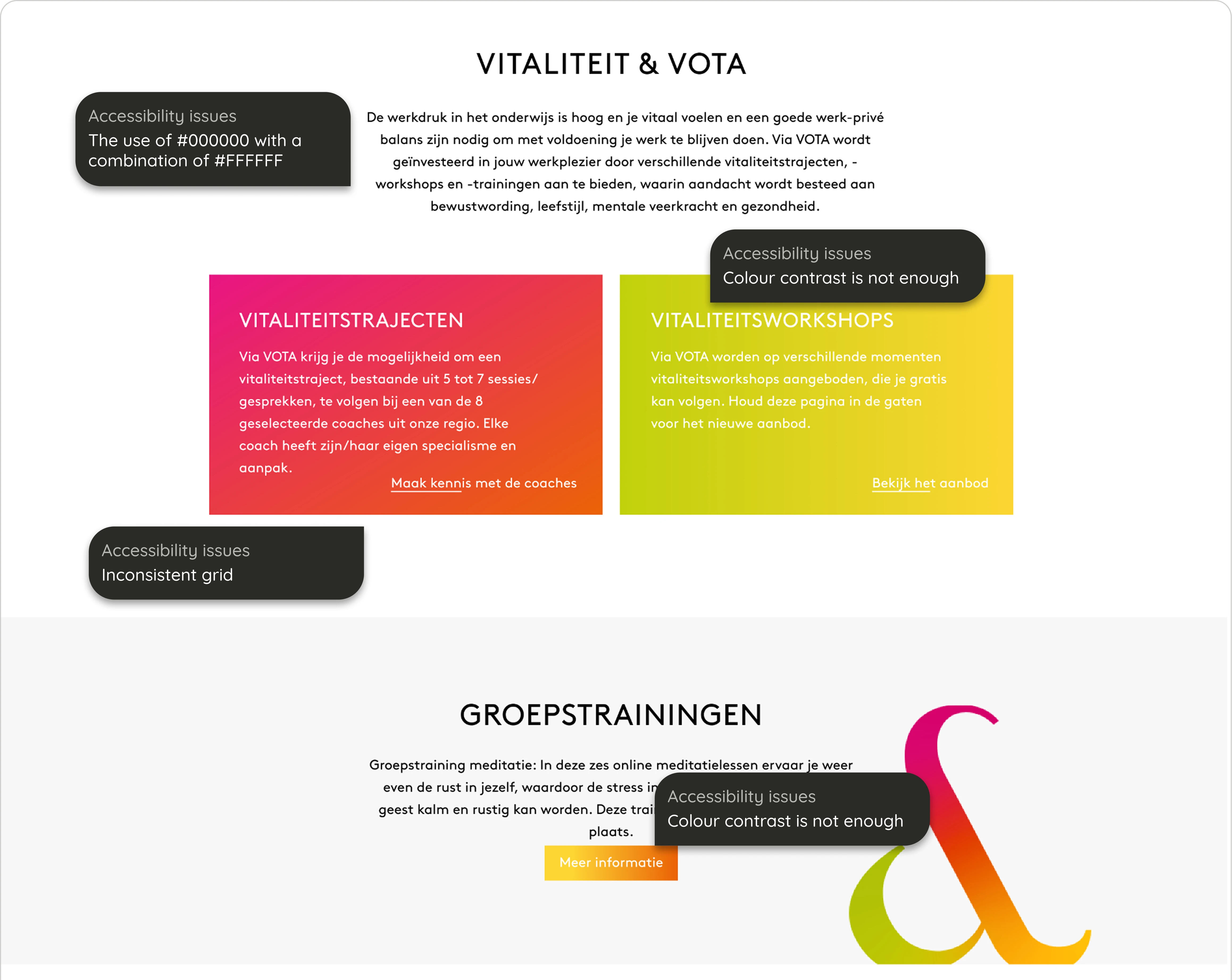
Testing the accessibility presented multiple issues with contrasting colours and lack of the use of a grid
My Solutions
Typography Overhaul
- Replaced all-caps headings with sentence case
- Introduced two typefaces for hierarchy and readability:
- Outfit for headers (clear, bold, modern)
- Roboto for body text (neutral and highly legible)
- Added clear line heights and spacing rules for text blocks
CTA & Interaction Design
- Created clear button states:
- Primary: Green with sufficient contrast on all backgrounds
- Secondary: Dark grey from the new grayscale system
- Links: Underline only on hover; removed inaccessible pink hover color
- Ensured all buttons meet minimum touch target size (44x44px)
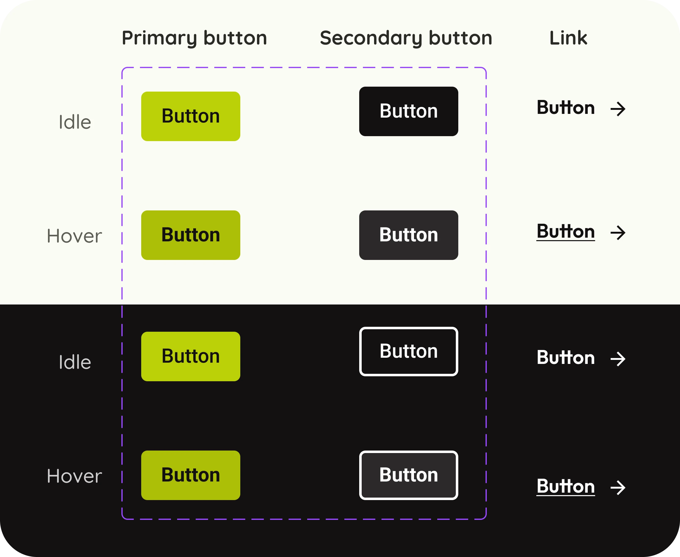
Defining the states and types of buttons
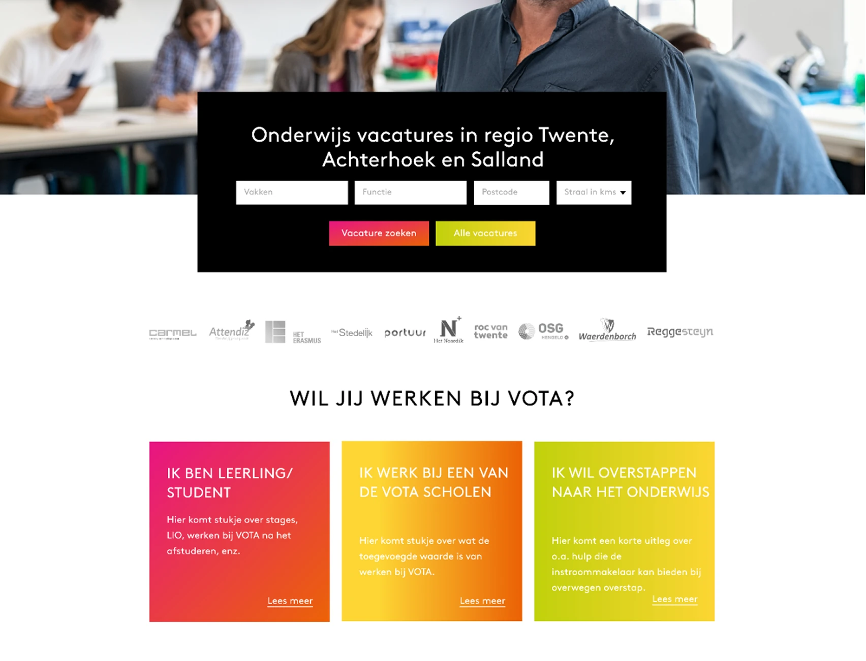
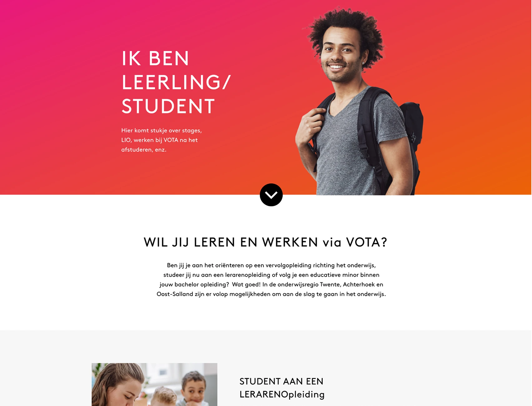
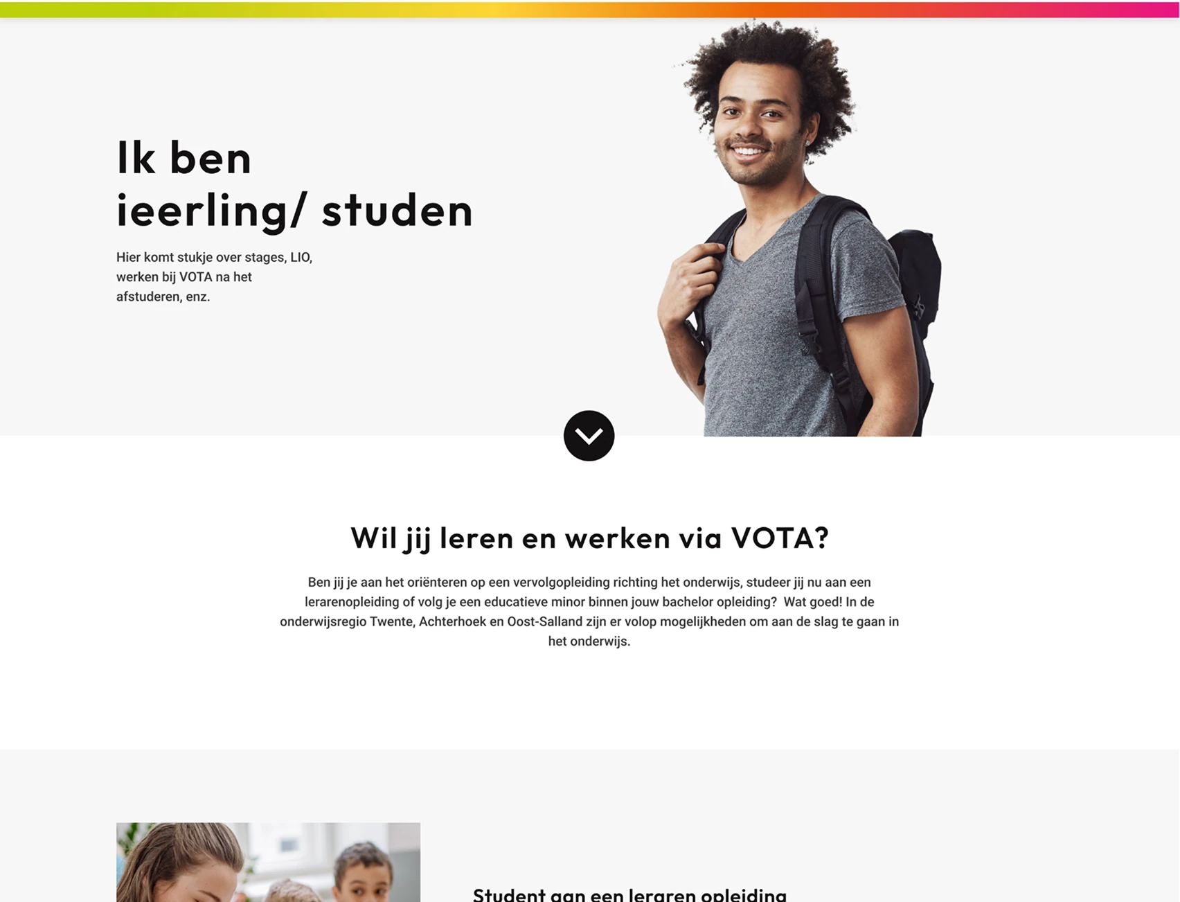
Before
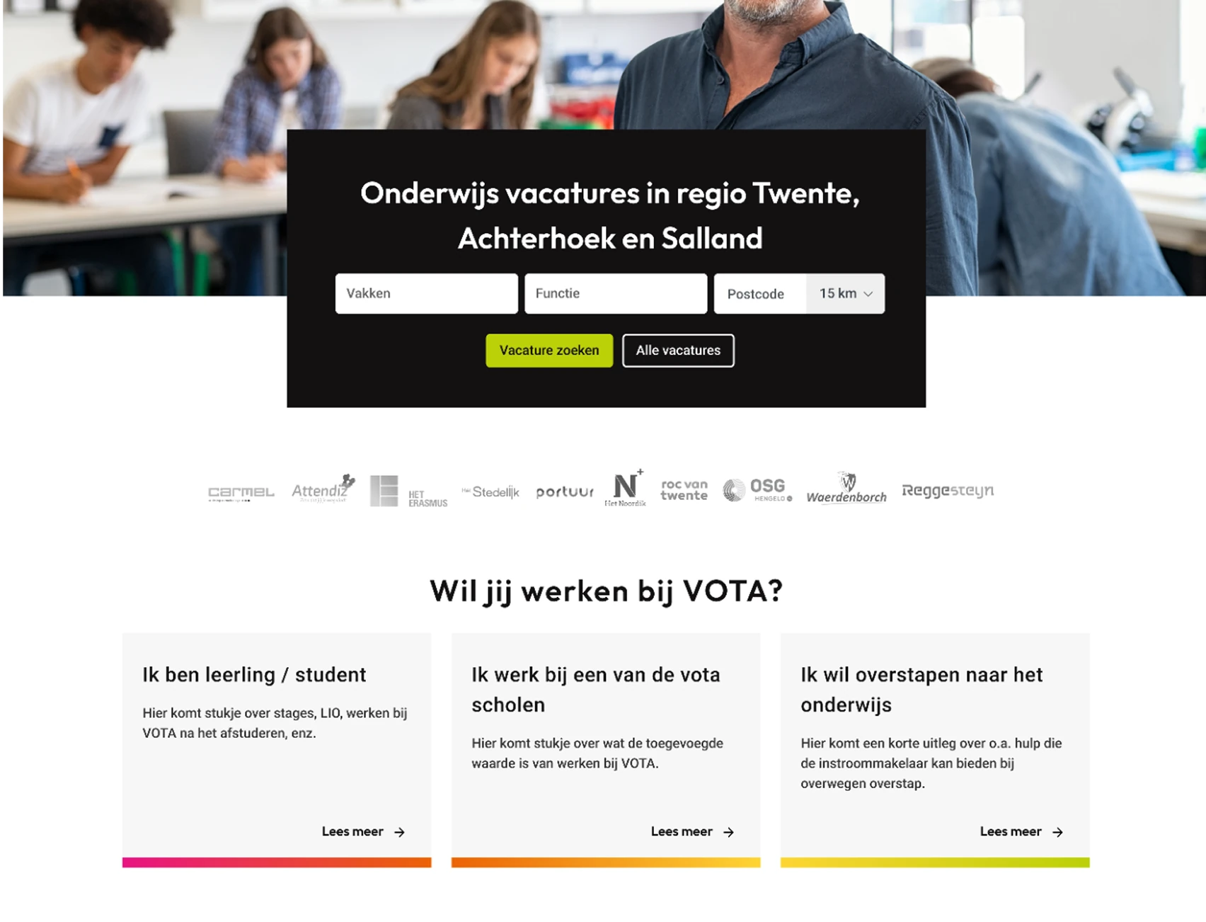
After
Showing hierarchy through the colours of CTAs
Color & Contrast System
The design previously relied on pure #000000 on #FFFFFF or white-on-gradient, both of which caused either eye strain or accessibility violations.
New Greyscale Palette:
- #131112 – Primary body color
- #353535 – Secondary headings
- #616060 – Tertiary labels
- #CECECE – Divider and border color
Tools Used:
- Stark (for contrast checking)
- Foundation Color Generator + Material Design tokens
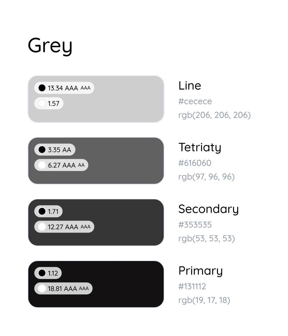
Testing the contrast of foreground and background colours
Strategic Use of Branding
Instead of using the gradient as a background, which caused readability issues, I repositioned it as:
- A visual accent in footers
- A thin underline in CTAs
- A static visual element behind low-content components
This retained the brand identity without compromising usability.
Before
After
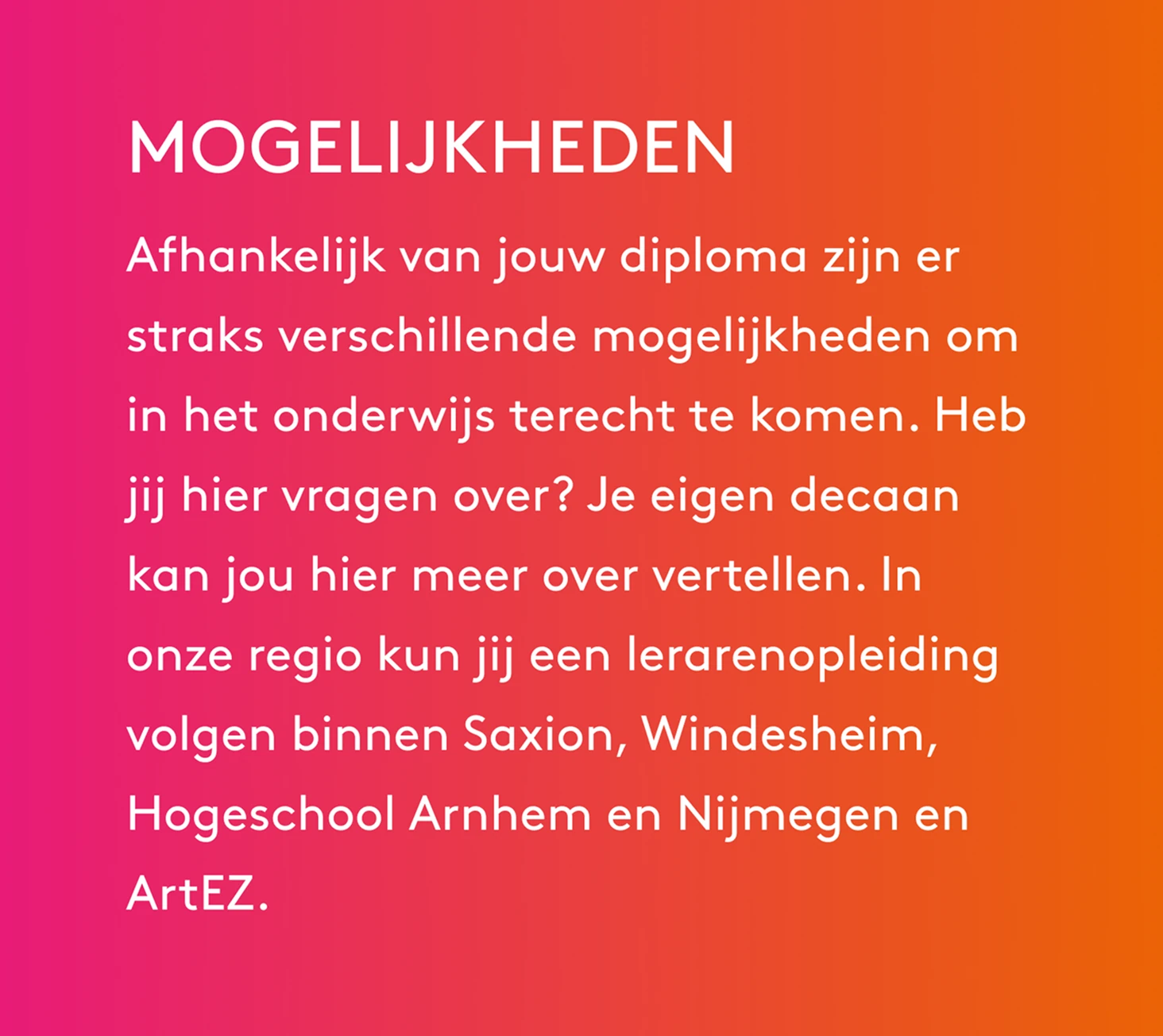
Adapting the gradient to be used as a branding element on text heavy components
Before
After
Adapting the gradient to create a visual hierarchy
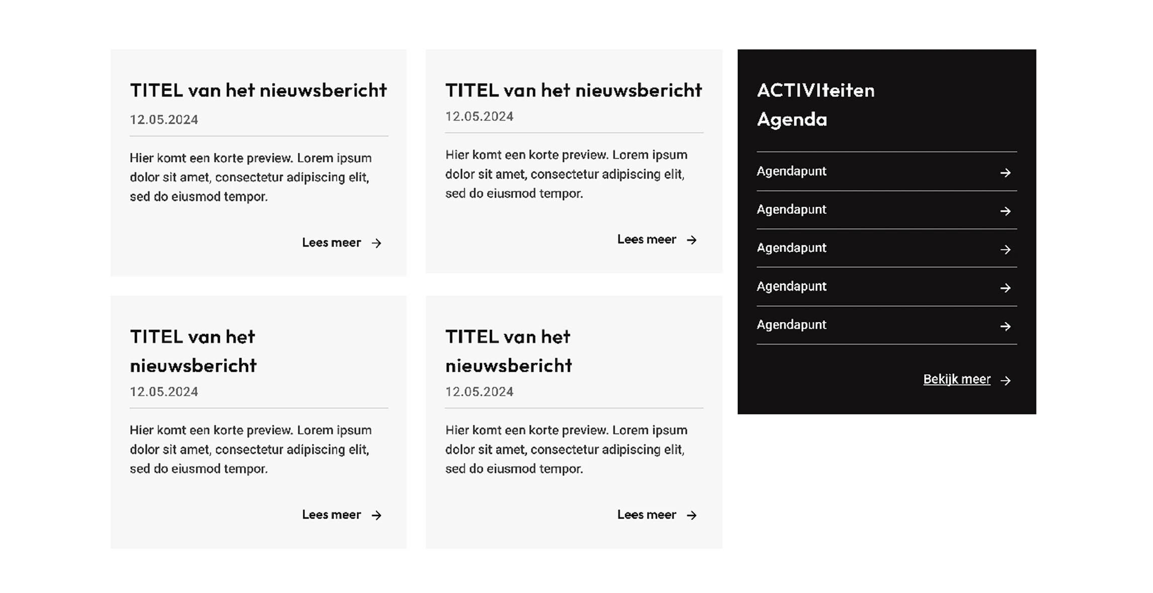
Layout & Hierarchy Redesign
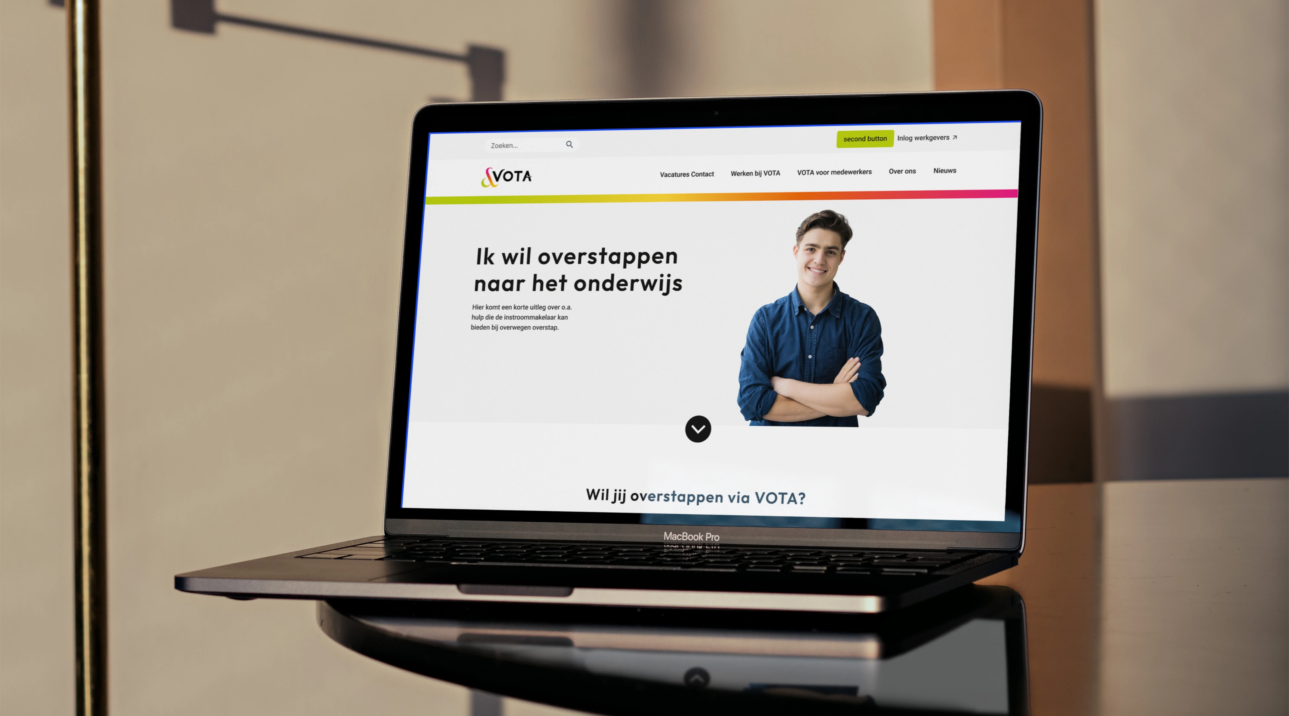
Header & Navigation
- Reduced three stacked headers into two streamlined layers
- Removed distracting gradient behind text
- Reorganized nav to prioritize job search and login CTA
Before
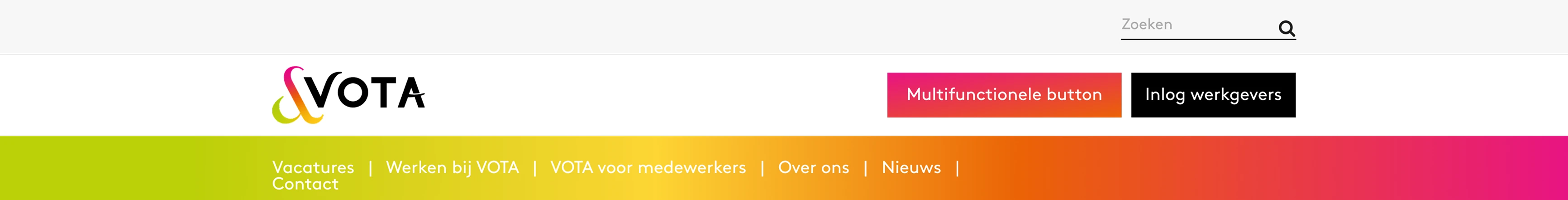
After
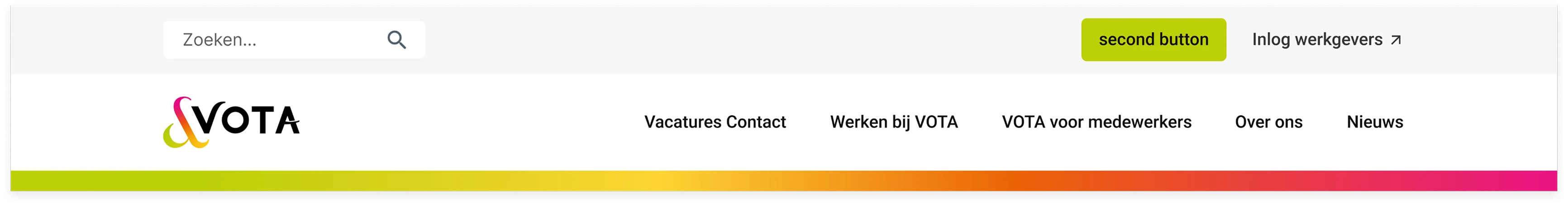
Changes to the header to further promote the hierarchy in the page
Grid system
- Applied a 12-column Bootstrap grid
- Ensured spacing on left/right for scalable layout
- Made it easy for developers to create breakpoints for all screen sizes
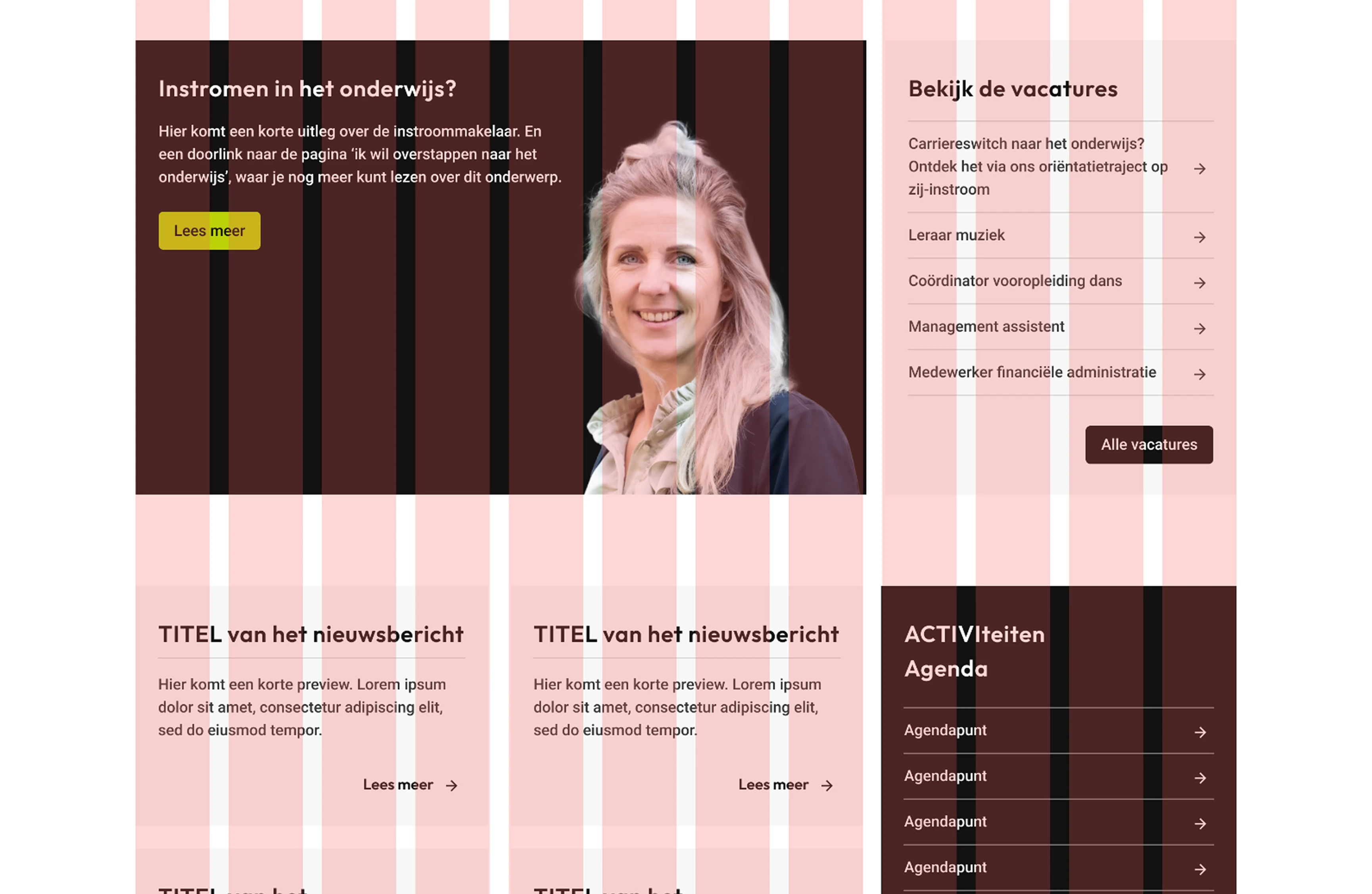
Utilizing bootstrap's grid system to support a flexible and scalable UI
Style Guide Foundation
The client lacked a style guide, so I began creating one to support development and future scalability.
Style Guide Elements:
- Typography: sizes, line heights, weights
- Color tokens: UI greyscale & branding colors
- Button states: default, hover, disabled
- Link styles
- Icon usage
- Spacing rules
Before
After
Adapting the gradient to create a visual hierarchy
Outcome & Reflection
Results
- All redesigned components passed WCAG 2.1 AA guidelines
- Improved text readability and layout clarity for all users
- Set a scalable design system for developers and future designers
- Created visual hierarchy that guides users to CTAs without confusion
Next Steps
- Finalize full style guide
- Test UI with screen readers and keyboard navigation
- Conduct usability test with older adults and users with cognitive impairments
- A/B test CTA design on desktop vs. mobile
Final Thoughts
This project sharpened my ability to detect subtle accessibility violations and rethink UI systems under pressure. It reminded me that good design rather than just being beautiful, it should be usable by everyone, everywhere.