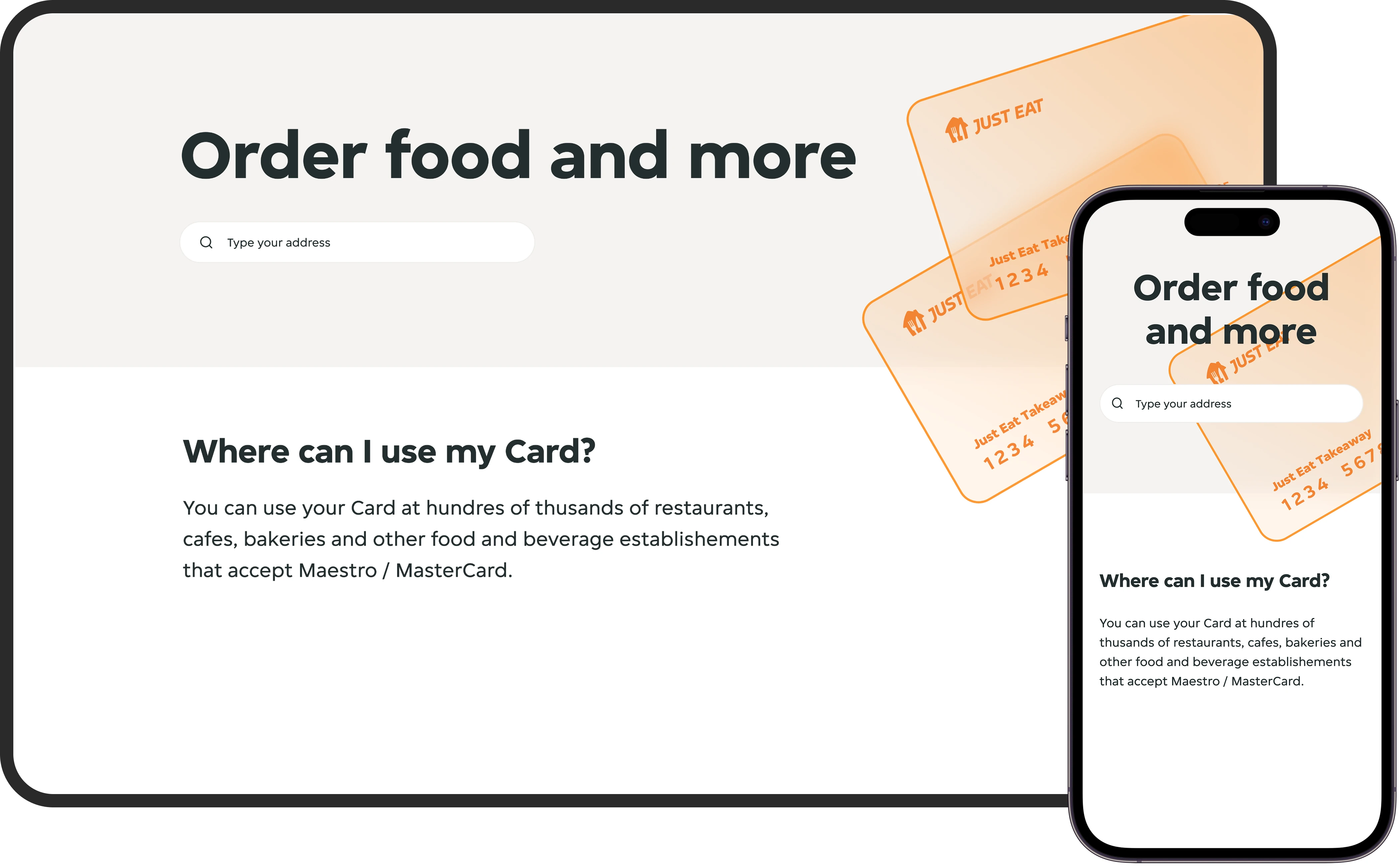
Where can I use my Just Eat Takeaway Pay Card?
Project Overview
Just Eat Takeaway offers a Pay Card for employees, which can be used at any Mastercard-labeled, even those not listed on the platform. However, many users were confused about where the card could actually be used. This case study focuses on the UI solution I designed to solve that problem by creating a restaurant overview experience that lives inside Takeaway for Business.
The Problem
Surveys revealed that the biggest source of confusion for Pay Card users was knowing where their card would be accepted. Despite the card being valid at any Mastercard-coded restaurant or bar, the lack of visibility created friction and uncertainty.
My goal was to design a clear, interactive interface that:
- Informs users where they can use the card
- Makes it easy to explore nearby options
- Communicates this without relying on color alone (for accessibility)
My Role
- Designed the entire interface for the Restaurant Overview
- Created a scalable icon system for different spot types
- Solved for accessibility and clarity, especially in dense areas
- Built and documented a full style guide for developer handoff
- Ensured full alignment with JET's strict brand guidelines
Research had already been conducted by the client. My role was execution-focused with detailed UI design and dev support.
Design Challenges & Solutions
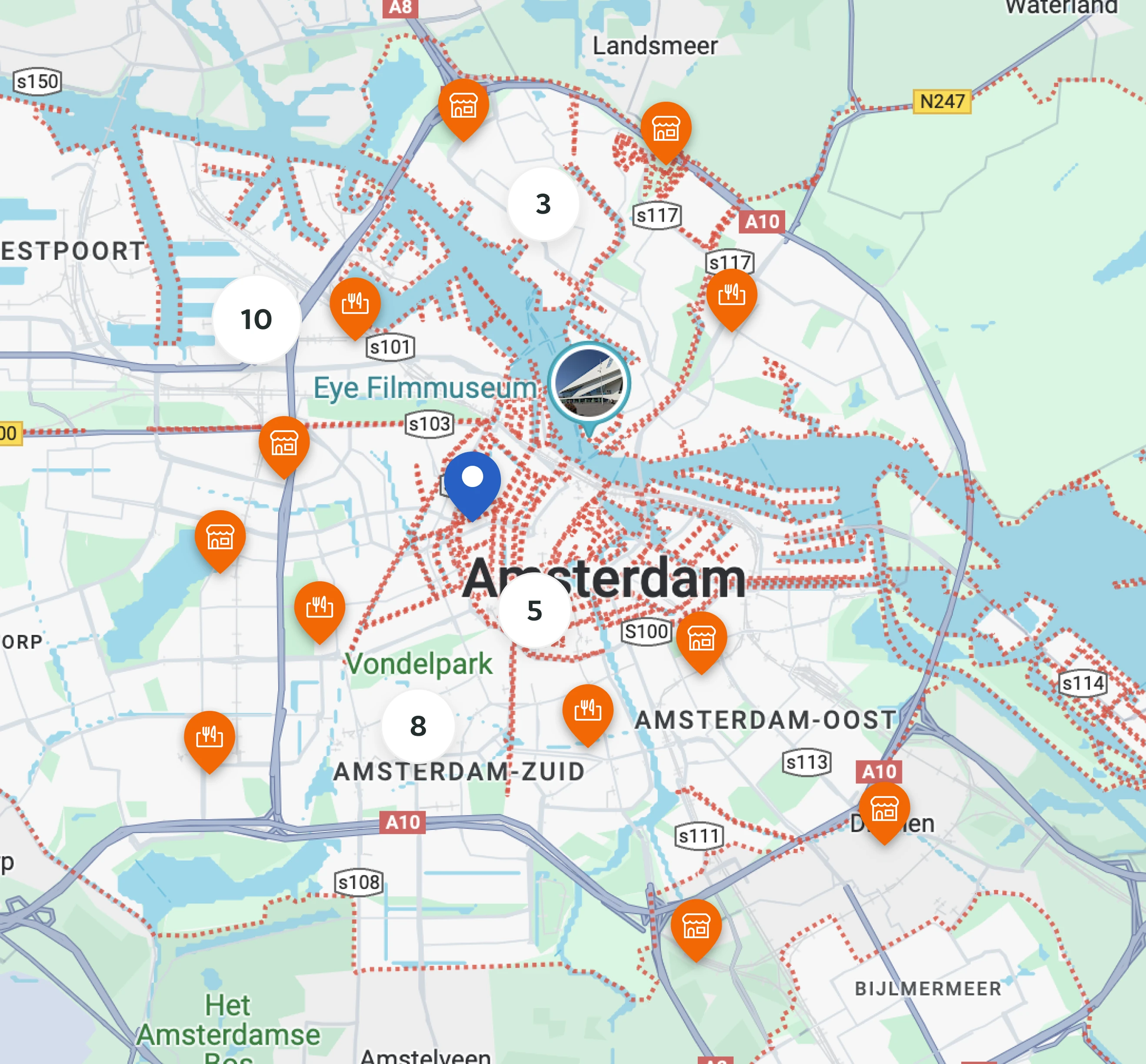
Challenge 1: Smart Map Interface for Dense Cities
Problem: Showing hundreds of eligible locations in urban areas without overwhelming the user.
Solution:
- Built a map-first experience with real-time panning and zoom
- Introduced cluster markers to group nearby restaurants
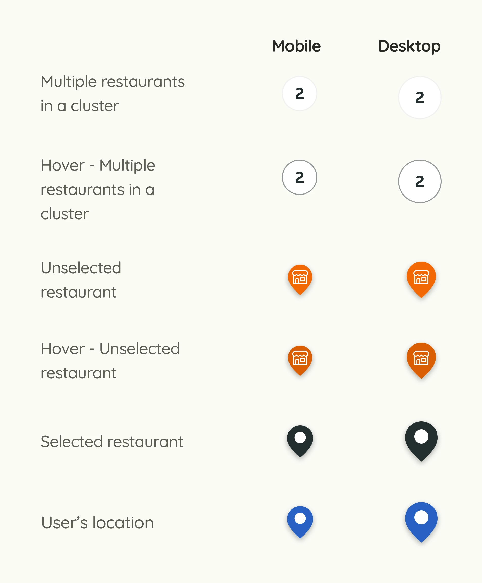
- Designed custom icon sets to differentiate spot types (e.g., bar vs restaurant)
- Created hover, selected, and unselected states for all markers
Accessibility Detail: Each marker uses both color and icon shape to ensure users with color blindness can still distinguish spot types.
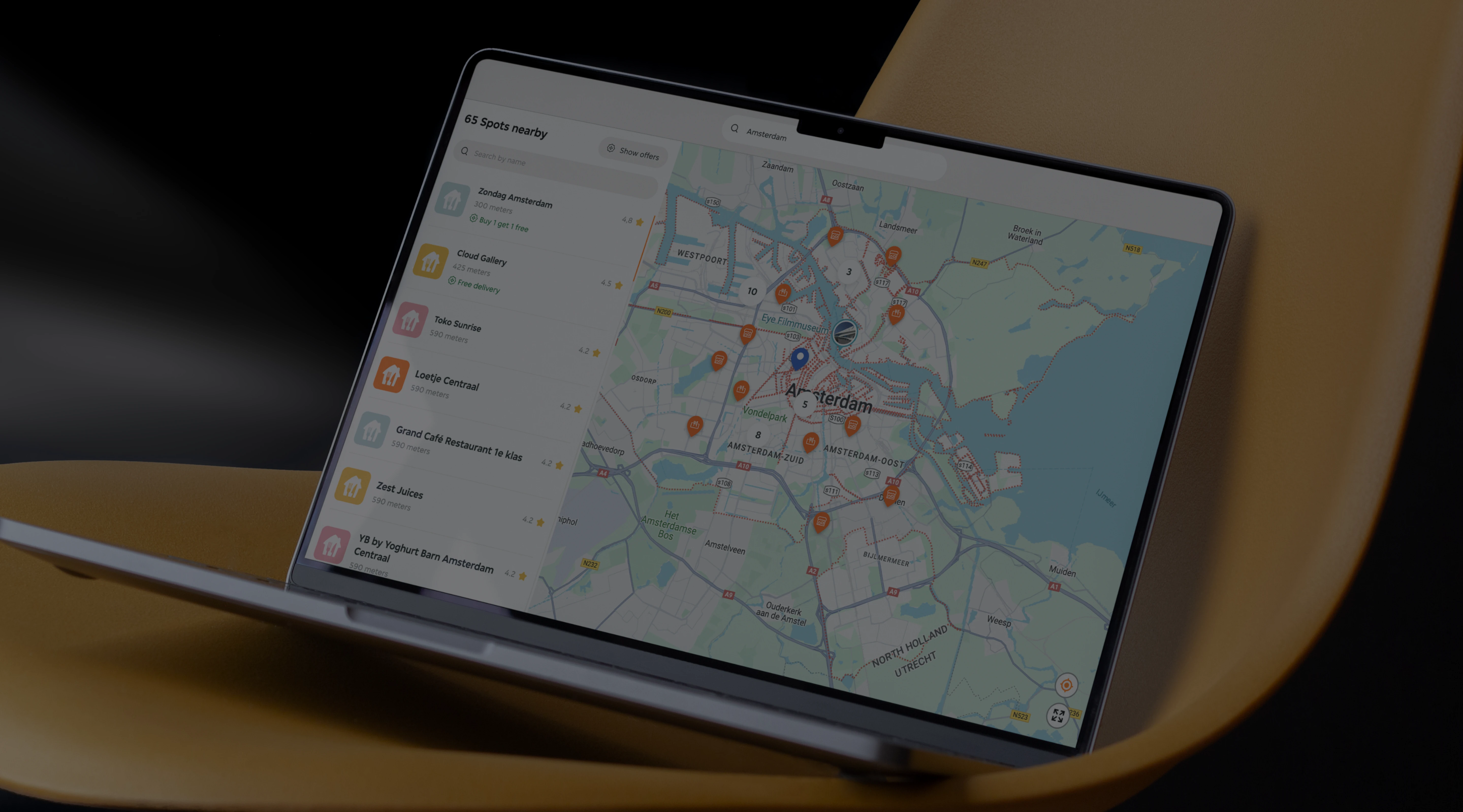
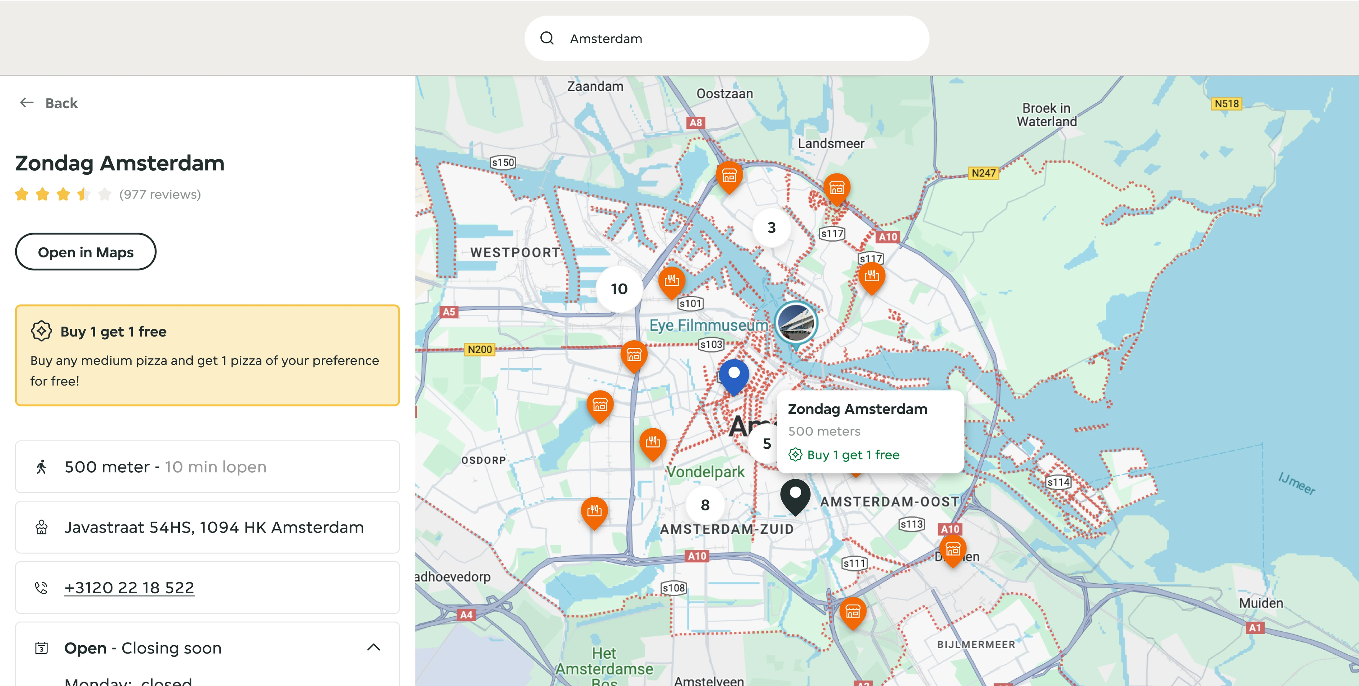
The UI of the map is one of the most important features in the project
Challenge 2: Location-Based Spot Discovery
Problem: Users needed to search and explore restaurants near them, even if not on the JET platform.
Solution:
- Simple address input or use of device location for immediate results
- Designed a synchronized side panel with a scrollable list of visible map spots
- List updates dynamically as the map is panned, keeping both views aligned
Each list item includes:
- Restaurant name
- Distance from user
- Ratings
- Promotions (if available)
The spot list and the map are always synchronised
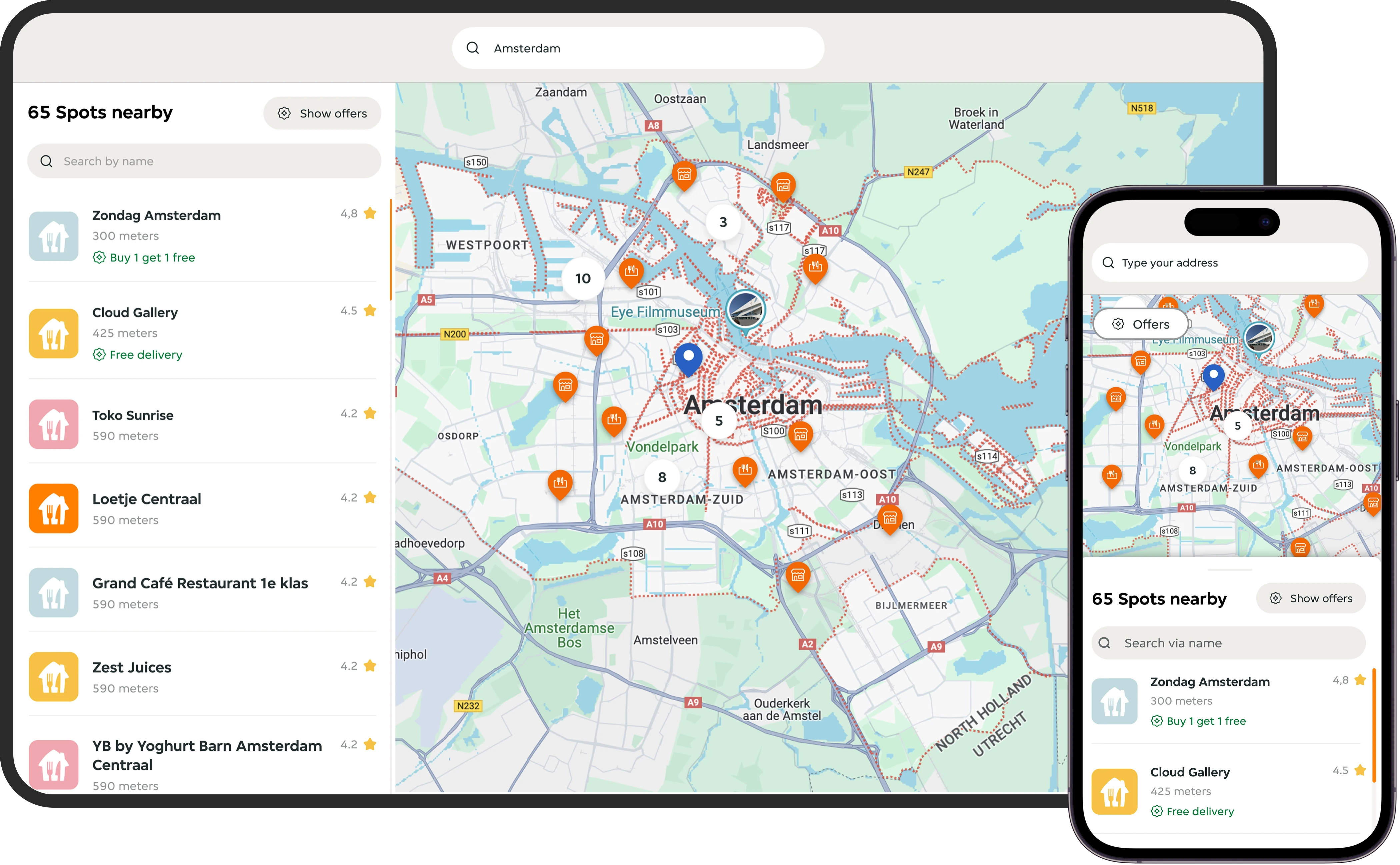
Challenge 3: Responsive UI & State Clarity
Problem: Maintaining state clarity across hover, selection, and clustering, on both mobile and desktop.
Solution:
- Built a mobile-responsive map and list UI that worked within an iframe container
- Defined clear visual states for all interactions:
- Default
- Hover
- Selected
- Clustered group
Accessibility Detail: States were visually distinctive even without relying on hover, which is helpful for keyboard or mobile users.
The landing eye-frame of the Takeaway Restaurant Overview
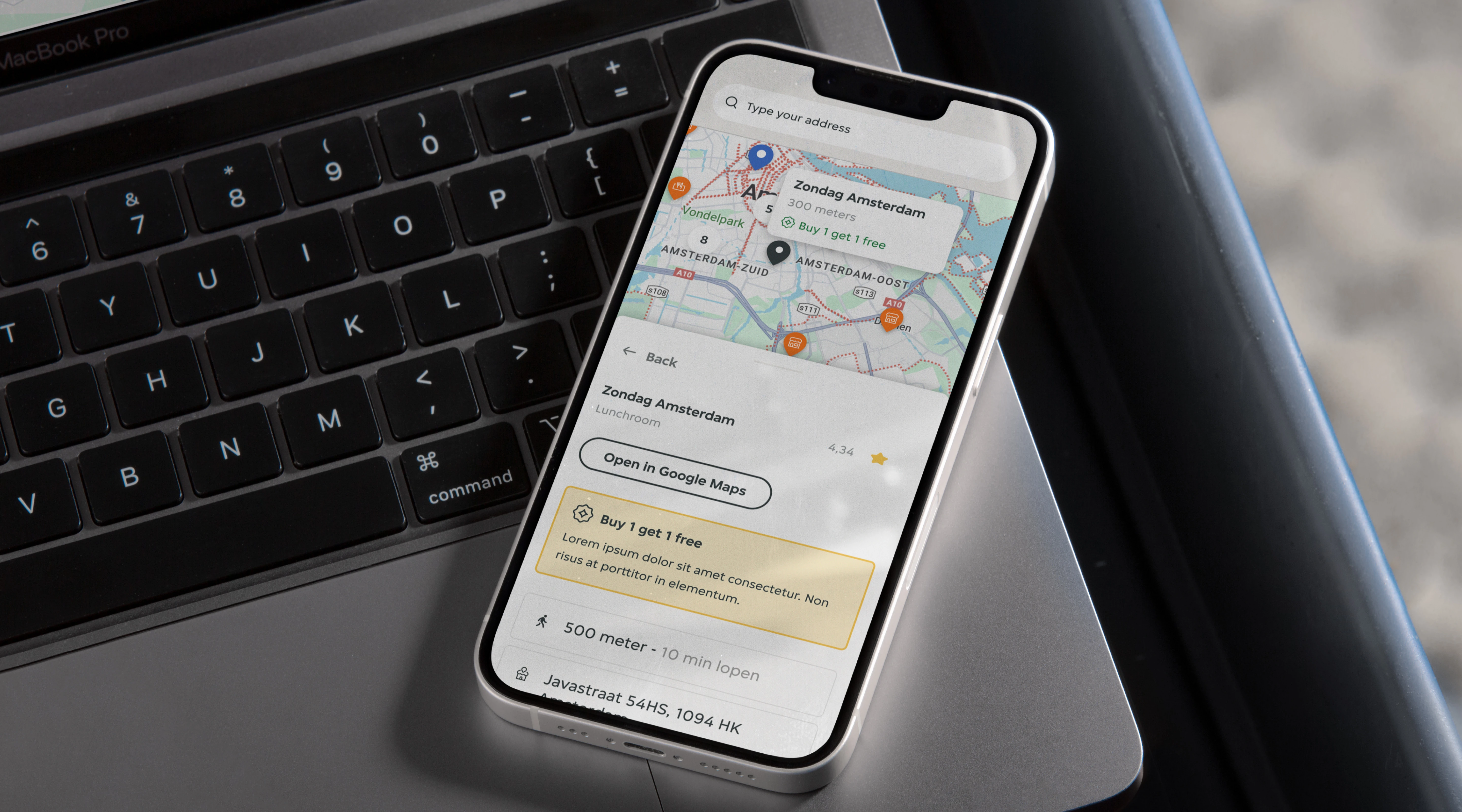
Spot Detail Page
When a user clicks a spot (from map or list), the view shifts to a spot-specific page with:
- Map highlight
- Name and details
- Visual confirmation that the restaurant accepts the Pay Card
This helped eliminate last-minute uncertainty for users trying to decide where to eat.
When the user selects the spot they want, then they have all the information they need to visit it
Developer Handoff & Style Guide
JET branding is precise and well-documented in order to support efficient development, I created a dedicated style guide with:
- Color and type tokens aligned with JET's global system
- All components documented with their states
- Icon system for map markers
- Spacing, breakpoints, and mobile specs
- Button and card designs
- Accessibility considerations included
The style guide ensured consistency and allowed developers to copy-paste fully specced components, reducing build time.
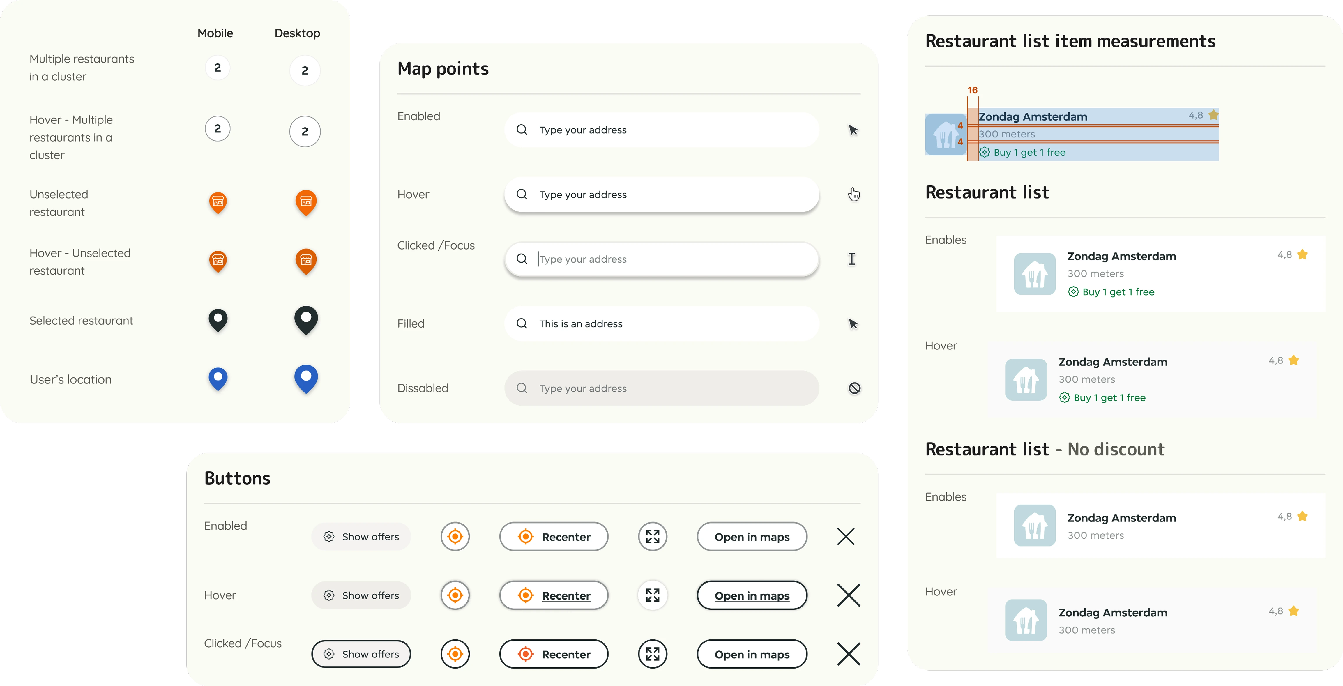
The styleguide presents the components used in the specific project while also ensuring the JET branding is followed
Outcome & Reflection
Next Steps
- Introduce advanced filtering
- Dietary needs (vegan, vegetarian, halal)
- Offers or deals
- Takeaway vs. dine-in vs. delivery
- Further personalization such as showing "favorites" or popular choices in the user's company
- Enhance balance awareness with indication of remaining card balance next to price estimates
Final Thoughts
This project was deceptively complex. The UI needed to be:
- Accessible across devices
- Clear without user training
- Consistent with rigid brand rules
- Flexible enough for high-density city maps
I focused on every visual state, accessibility edge case, and component scalability, ensuring a seamless experience for both users and developers.
This case reflects my strength in working with complex component systems, being detail-oriented, and designing for clarity, performance, and accessibility.